AB Collection
Why It's In The Canon
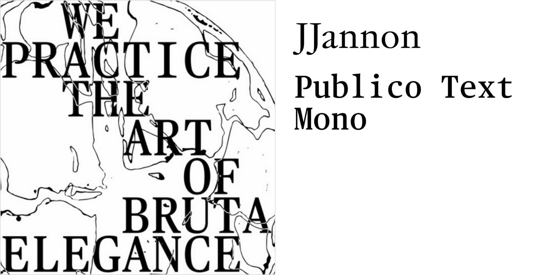
JJannon paired with Publico Text Mono is a pairing that shouldn't resolve — old-style Janson revival against a gridded slab mono — but AB Collection demonstrates why it does, and how. Study it for the editorial logic: JJannon carries display weight with real consequence (ink traps, compressed oldstyle numerals, that quality of reading as simultaneously archival and alert), while Publico Text Mono handles the functional layer — pricing, spec copy, anything that has to be read fast and accurately. The slab-serif DNA in Publico means it doesn't fight JJannon; it brackets it. The serif registers are different enough to create contrast, close enough to hold a system.
What's rare here is type selection functioning as argument rather than decoration. JJannon is the kind of choice made by people who've already absorbed the serif canon — it doesn't announce "luxury," it just operates at that register without trying. For anyone building brand systems, editorial interfaces, or creative tools with a typographic opinion, this pairing shows how to work high-contrast serif territory without defaulting to the generic fallback (Garamond with a grotesque, always). The discipline is in what's absent: no safety-net sans, no hedging toward familiarity. The collection commits to the pairing and lets it do the arguing.


