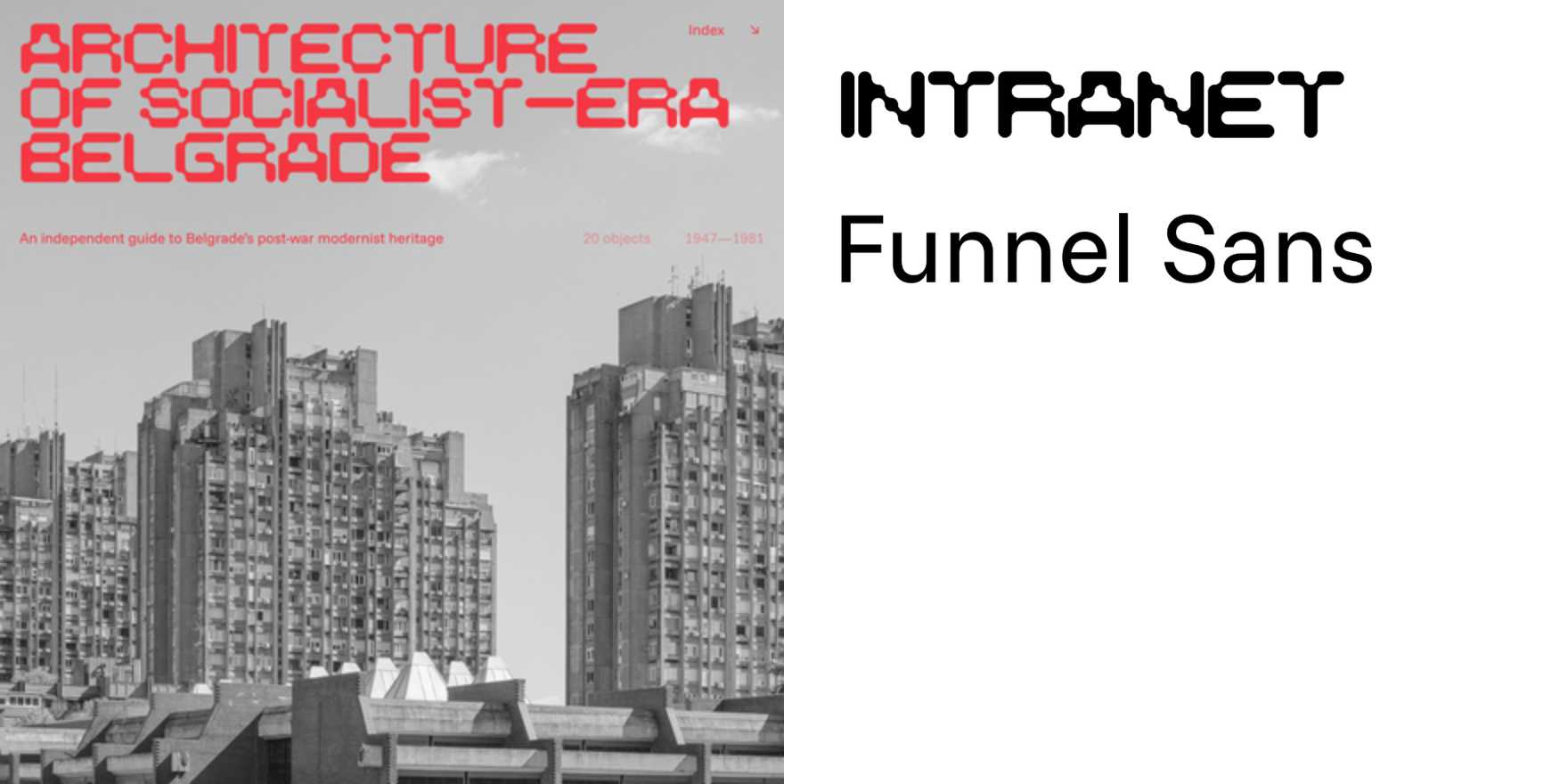
Architecture of Socialist-Era Belgrade
Why It's In The Canon
The architecture of Socialist-Era Belgrade exemplifies a unique blend of functionalism and monumentalism that had a profound impact on Eastern European urban design. Its influence on typography is evident in the bold, sans-serif fonts used in public signage and advertising, reflecting a desire for clarity and modernity. These fonts, with their clean lines and geometric shapes, stand out not just in Belgrade but across the region, serving as a visual shorthand for a period of rapid industrialization and political transformation. For designers and toolmakers today, studying these typographic choices offers insights into the balance between aesthetic appeal and practical functionality. This is particularly relevant in the creation of user-friendly interfaces and visual branding for digital platforms, where legibility and cultural resonance are paramount. The ability to evoke a sense of heritage and forward-thinking through typography remains a critical skill, making the Socialist-Era Belgrade's architectural typography an essential study for anyone crafting modern visual communications.