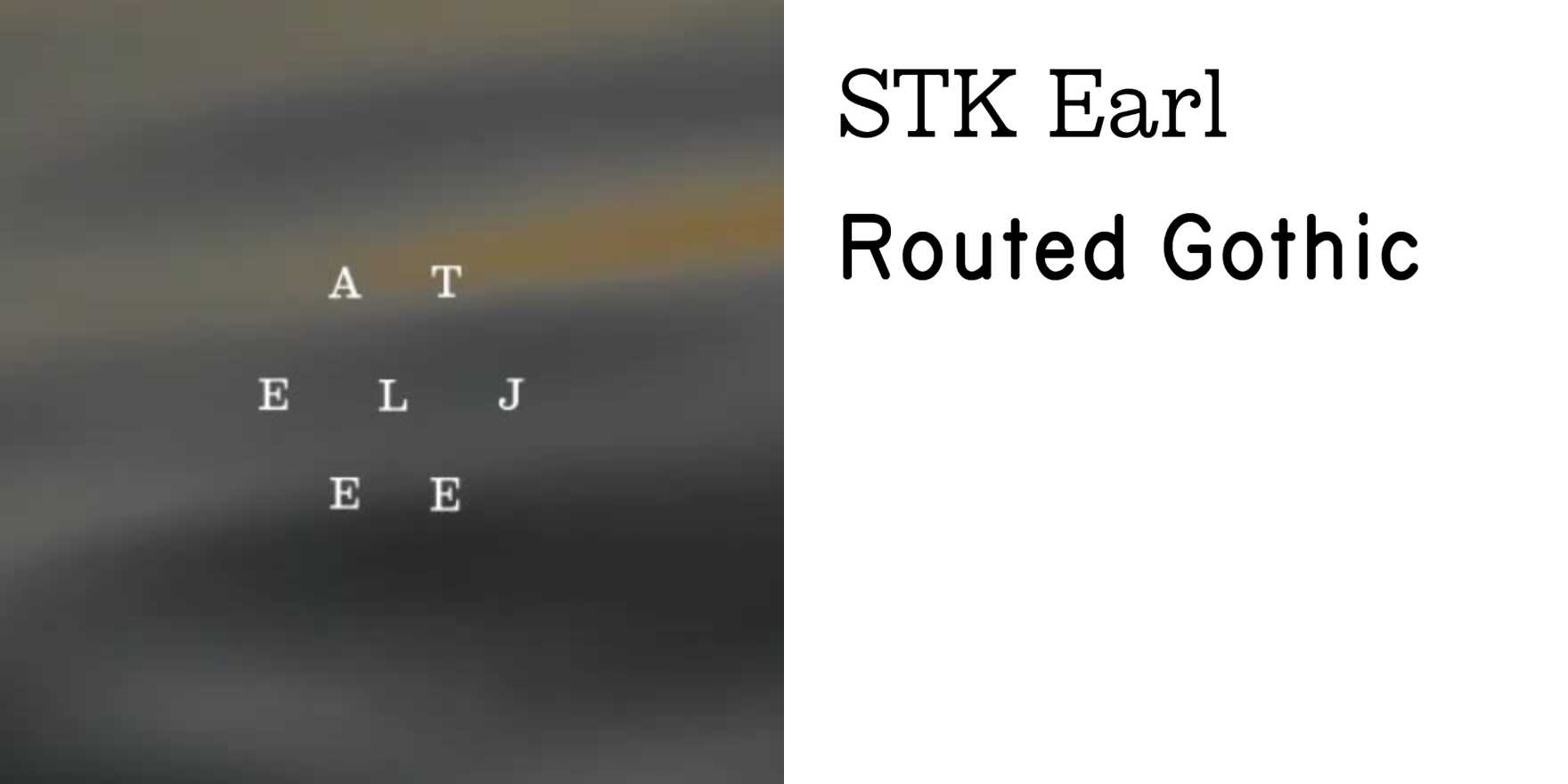
Ateljee
Why It's In The Canon
Finnish studios tend to treat type as load-bearing structure rather than decoration, and Ateljee operates in that tradition with unusual consistency. What earns the entry isn't any single project but the pattern: tight editorial hierarchy, type set with genuine awareness of optical margin and white space as active material, and a refusal to reach for display weight when text weight will hold the composition. The Finnish-Swedish word ateljee — atelier, workshop — signals something about the self-conception: this is craft practice, not styling.
Study the spacing decisions first, before anything else. The letterspacing on caps, the line-height choices in running text, the column widths — these are not defaults. Someone made calls. For anyone building design systems or editorial interfaces, this is the useful part: seeing type-in-use where every setting is intentional means you start recognizing unintentional settings elsewhere, including in your own work.
The Nordic lineage here runs through Müller-Brockmann and the post-war Swiss grid but arrives somewhere distinctly quieter — less programmatic, more intuitive. That's the cultural literacy angle. Scandinavian design discourse often positions restraint as moral position rather than aesthetic; Ateljee's work lets you see what that actually produces in practice, without the manifesto.
Closest kin


