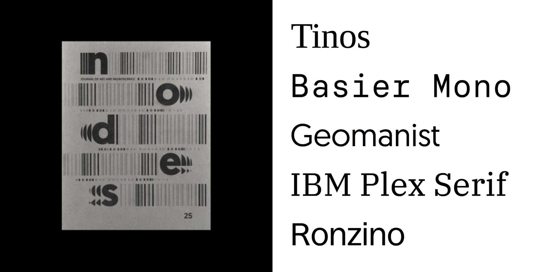
Barro
Why It's In The Canon
Barro, designed by Tobias Frere-Jones and released by Hoefler & Co., is a typeface that exemplifies the modernist approach to typography. Its clean, geometric forms and precise proportions make it a staple in professional design, particularly for its clarity and readability in digital contexts. The sans-serif design has a subtle organic quality, which sets it apart from more aggressively geometric typefaces. Its influence is evident in contemporary branding and web design, where it is used to convey a sense of elegance and sophistication without sacrificing legibility. Understanding Barro's design principles and how it balances form and function is essential for anyone working on web platforms and creative tooling, as it serves as a benchmark for modern typeface design.