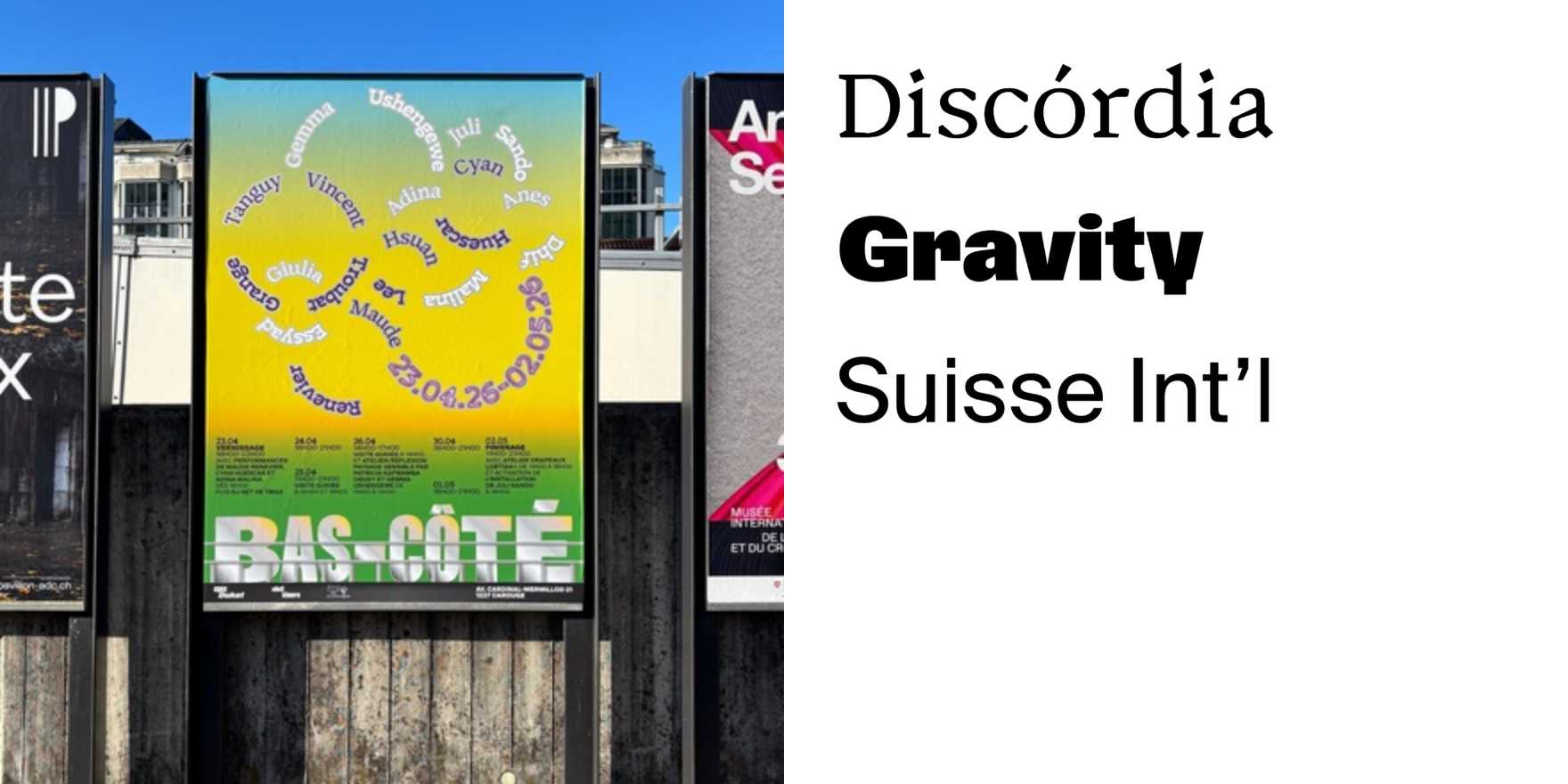
Bas-Côté
Why It's In The Canon
Bas-Côté is a typeface that deserves a place in the canon because it stands out in the history of modernist typography. Designed in 1927, this sans-serif typeface is notable for its clean, geometric forms, which were highly influential in the 1920s and 1930s. Its simplicity and clarity align with the principles of the International Style, making it a cornerstone in the development of modernist graphic design. For designers working today, studying Bas-Côté offers valuable insights into the constraints and possibilities of geometric sans-serif typefaces. Its influence extends to contemporary digital typefaces, where its clean lines and balanced proportions continue to inspire. Understanding Bas-Côté helps in appreciating how early 20th-century design principles shaped modern digital typography, making it a crucial element in the toolkit of any designer focused on clear, effective communication.