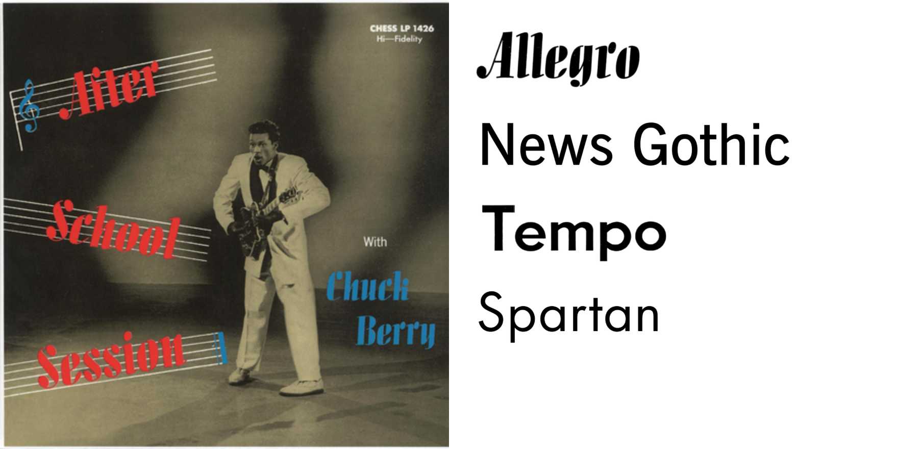
Chuck Berry –
Why It's In The Canon
The vernacular display lettering that surrounded Chuck Berry's career — Chess Records sleeves, marquee bills, promotional cards — is one of the densest training sets for understanding how type carries energy without trying to. These weren't designed in the contemporary sense. They were executed: letterers working fast, brush scripts and condensed gothics chosen for impact at distance, not for refinement up close. That's precisely what makes them study material. The letterforms have the same quality as the music — rhythm enforced structurally, not ornamentally.
What you're looking at when you look at this era of type-in-use is the last generation of lettering before phototypesetting flattened everything into catalog fonts. The idiosyncrasies are load-bearing. The slight inconsistencies in stroke weight, the way a descender gets compressed to fit the slug — those aren't errors, they're the texture that signals authenticity. Contemporary brand work spends enormous effort trying to re-introduce that texture artificially. Studying the source is faster. For anyone making design tools or building brand systems: the lesson is that constraints applied at speed produce character that constraints applied deliberately rarely do. The type on a Chuck Berry poster wasn't trying to look like anything. It was doing a job. That distinction matters more than almost any formal typography principle you'll read about.
Closest kin


