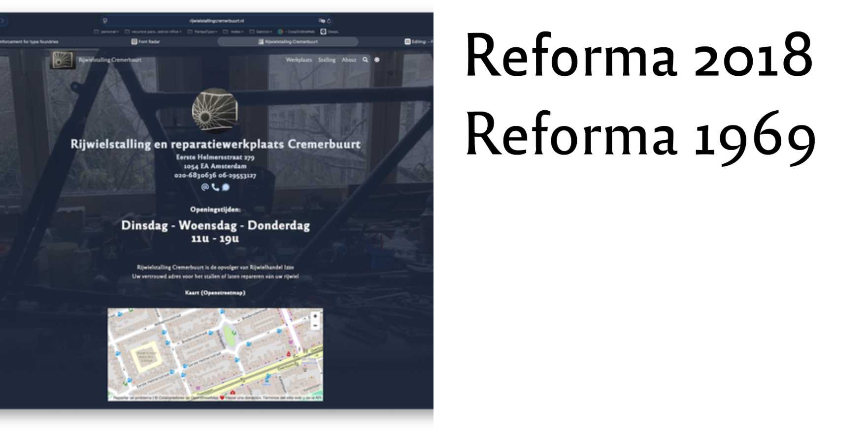
Cremerbuurt website
Why It's In The Canon
The Cremerbuurt website stands out as a testament to clean, functional design principles. Its use of whitespace and a straightforward grid structure makes it a model for modern typography and layout. The deliberate choice of a sans-serif font, coupled with careful kerning and letter spacing, ensures readability and a modern aesthetic. This website's focus on simplicity and clarity is crucial for any designer working on user interfaces or web platforms today, as it emphasizes the importance of minimalism in digital communication. Its effective use of typography as a design element showcases how type can enhance both usability and visual appeal, making it an essential study for anyone aiming to create intuitive and aesthetically pleasing web experiences.