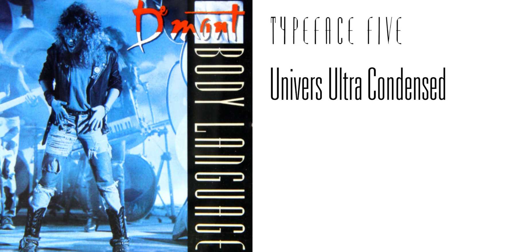
De Mont –
Why It's In The Canon
De Mont is a typeface that stands out due to its bold, dynamic geometry and clear readability. Designed in 1987, it predates many modern digital typefaces, offering a unique blend of old-world craftsmanship and contemporary design principles. Its geometric sans-serif nature makes it versatile for a range of applications, from web design to branding. The typeface’s influence is evident in the clean, modern interfaces of today’s digital tools and platforms. Its structured yet expressive forms serve as a blueprint for minimalistic design aesthetics that prioritize functionality and aesthetic appeal. For designers working on web platforms or creative tooling, De Mont is a critical study in how to balance simplicity with visual impact. By examining its construction and typographic choices, one can understand the enduring principles of effective, user-friendly type design.