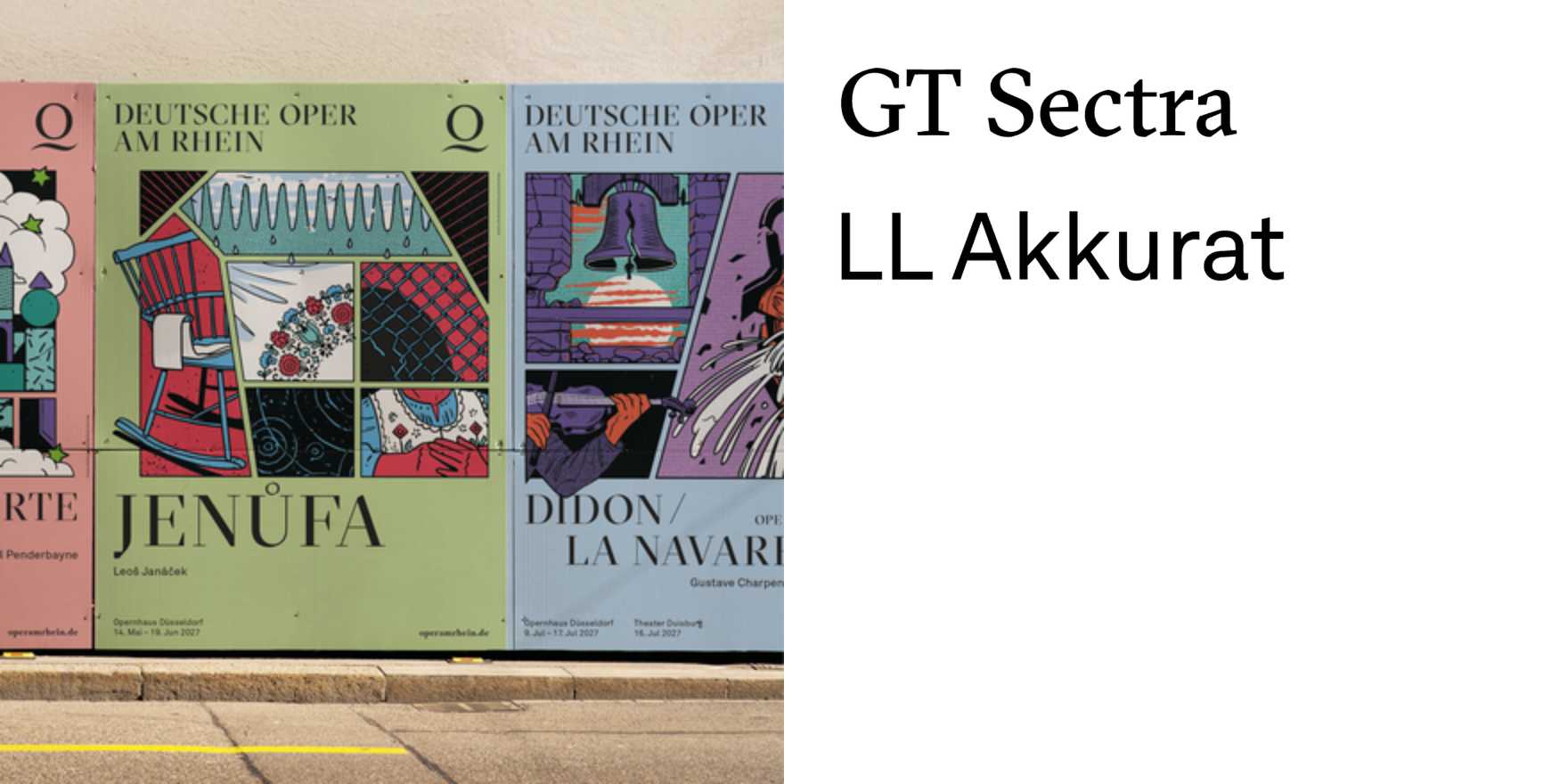
Deutsche Oper am Rhein premiere posters 2026/27
Why It's In The Canon
These posters embody the perfect intersection of modernist design principles and contemporary typography. The use of sans-serif fonts with clean, geometric lines showcases a minimalist aesthetic that resonates with current trends in digital design. The high contrast and bold, impactful layouts make them immediately recognizable and memorable, essential qualities for branding and web platforms. The integration of digital and physical mediums in their execution highlights the importance of cross-platform design thinking. By studying these posters, designers can learn how to create works that are not only visually striking but also functionally effective in today's fast-paced, digital-first world. The posters’ ability to convey complex information succinctly and aesthetically is crucial for anyone working on creative tooling or branding strategies.