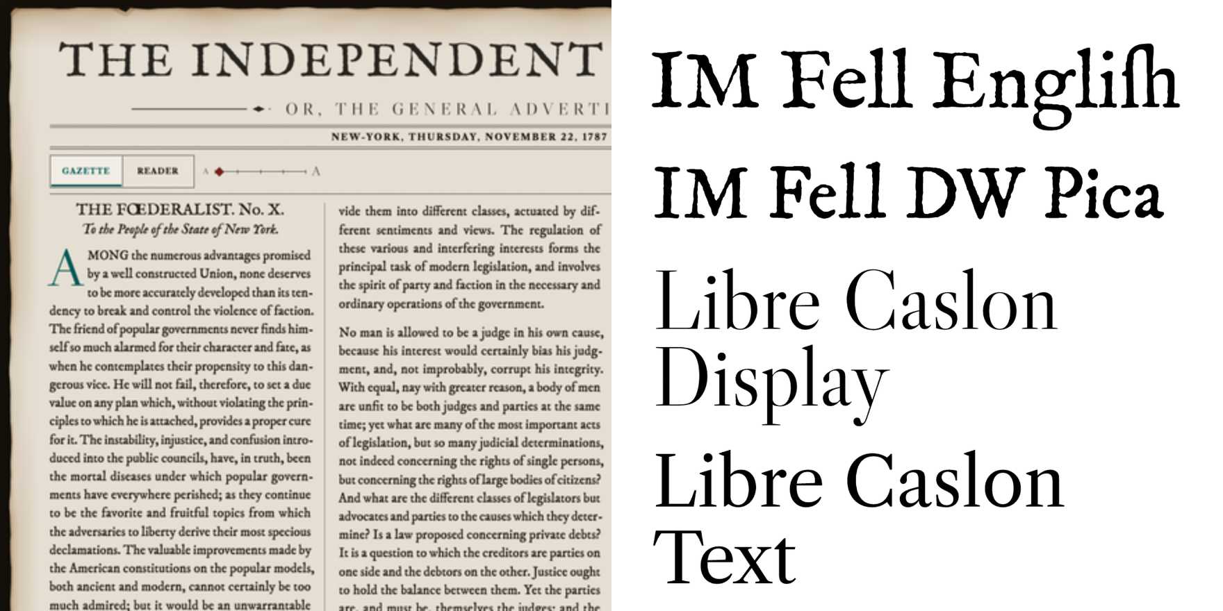
Federalist Reader
Why It's In The Canon
The Federalist Reader, designed by Jonathan Hoefler and Tobias Frere-Jones, is a typeface that matters because it epitomizes the modernist approach to typography, focusing on clarity and legibility. Its sans-serif design, characterized by its geometric forms and open counters, makes it an ideal choice for digital environments. The typeface's clean lines and uniform stroke width ensure readability on screens, a critical aspect for contemporary design. Additionally, its use in influential publications like The Economist and The New York Times has solidified its status as a benchmark for professional typography. For anyone working on creative tooling or web platforms, understanding the Federalist Reader is essential for grasping how typefaces can be optimized for digital readability while maintaining aesthetic integrity.