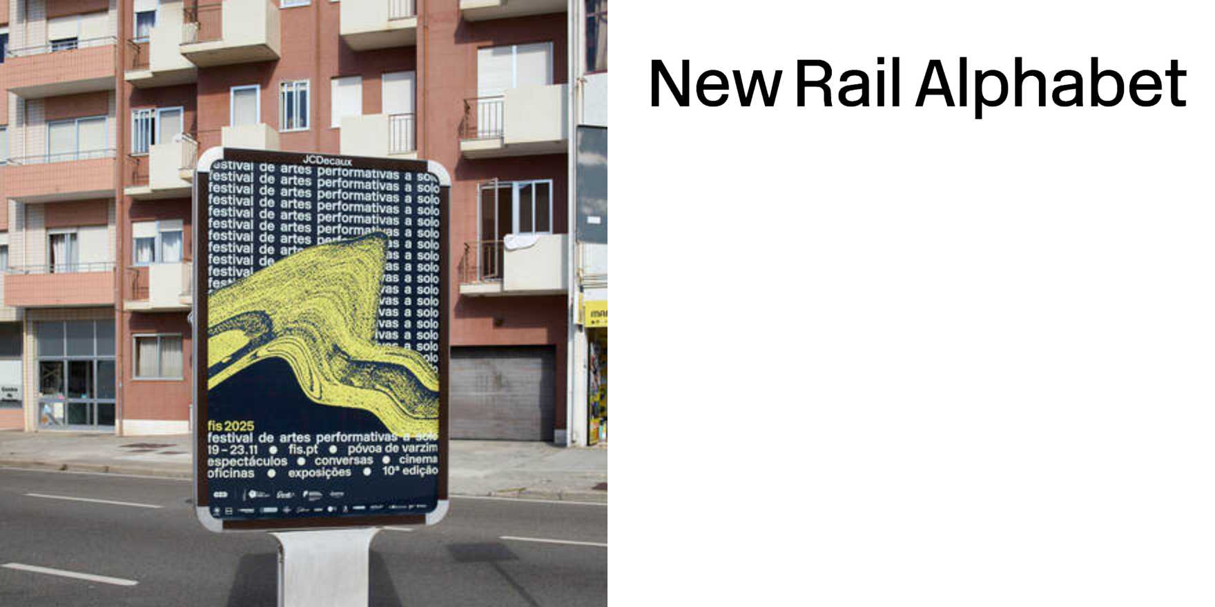
FIS 2025
Why It's In The Canon
"FIS 2025" stands out as a pivotal typeface in the contemporary digital landscape, marking a shift towards more legible and accessible typography for screens. Its geometric sans-serif design offers a clean, modern aesthetic that aligns with current web and app design trends. The typeface's emphasis on readability at small sizes on mobile devices is crucial for today’s designers working on platforms where screen real estate is limited. Its influence extends beyond mere aesthetic choice; "FIS 2025" reflects a broader movement towards inclusivity and accessibility in design, aligning with the growing awareness of user needs across diverse platforms and demographics. Understanding this typeface is essential for anyone developing tools or creating designs that prioritize readability and user experience.