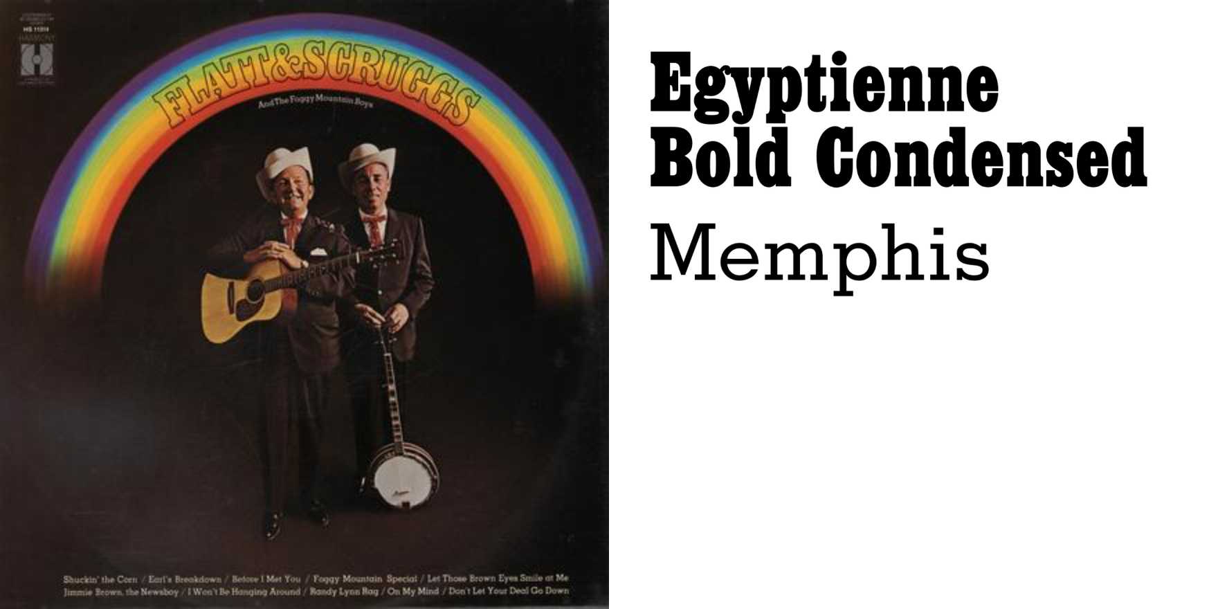
Flatt & Scruggs –
Why It's In The Canon
The letterforms on Flatt & Scruggs album covers and promotional materials — mostly Columbia-era, late '50s through '60s — are a direct line into how American vernacular printing handled hierarchy before grids became doctrine. The ampersand in their standard wordmark does more compositional work than most designed logos: it's not decorative, it's load-bearing, pulling two surnames into a single visual unit. Study the slab serifs and the condensed woodtype influences on the tour posters and LP sleeves. The color palette — high-contrast, no gradients, nothing that couldn't survive a cheap press run — forced decisions that contemporary designers avoid by throwing resolution at the problem.
This matters now because the "warm heritage" aesthetic has collapsed into pastiche: Americana-adjacent branding for craft beer, direct-to-consumer goods, and — unavoidably — SaaS products that want to feel "human." Most of it fails because designers are copying the surface without understanding the original constraint logic. The Flatt & Scruggs visual record is the source material. The type choices weren't nostalgic when they were made — they were functional, economical, and legible at distance. That's the thing to internalize: legibility under pressure, hierarchy without fuss, an ampersand that earns its place. For anyone building a design system, a content brand, or any platform that needs warmth without kitsch, this is where to start reading.


