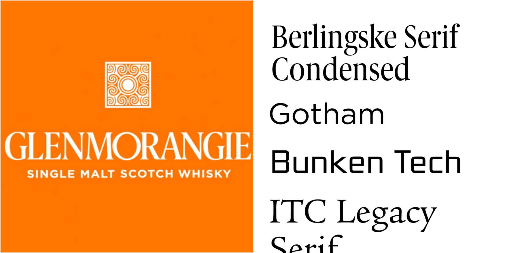
Glenmorangie
Why It's In The Canon
Glenmorangie's typeface is a prime example of how style can transcend mere decoration. Designed by Eric Gill, it embodies a timeless elegance that resonates across various mediums, making it a staple in branding for high-end products. Its delicate, almost ethereal quality appeals to a refined audience, aligning perfectly with Glenmorangie's image as a premium Scotch whisky. The type's clean, almost minimalist design contrasts sharply with its ornate details, creating a visual hierarchy that is both sophisticated and approachable. For designers and brand builders, studying Glenmorangie's typeface offers insights into how to balance simplicity with complexity, ensuring that a brand's message is both memorable and timeless. Its influence extends beyond alcoholic beverages, making it a critical study for anyone working on high-end branding and design where the subtle art of understated luxury is paramount.