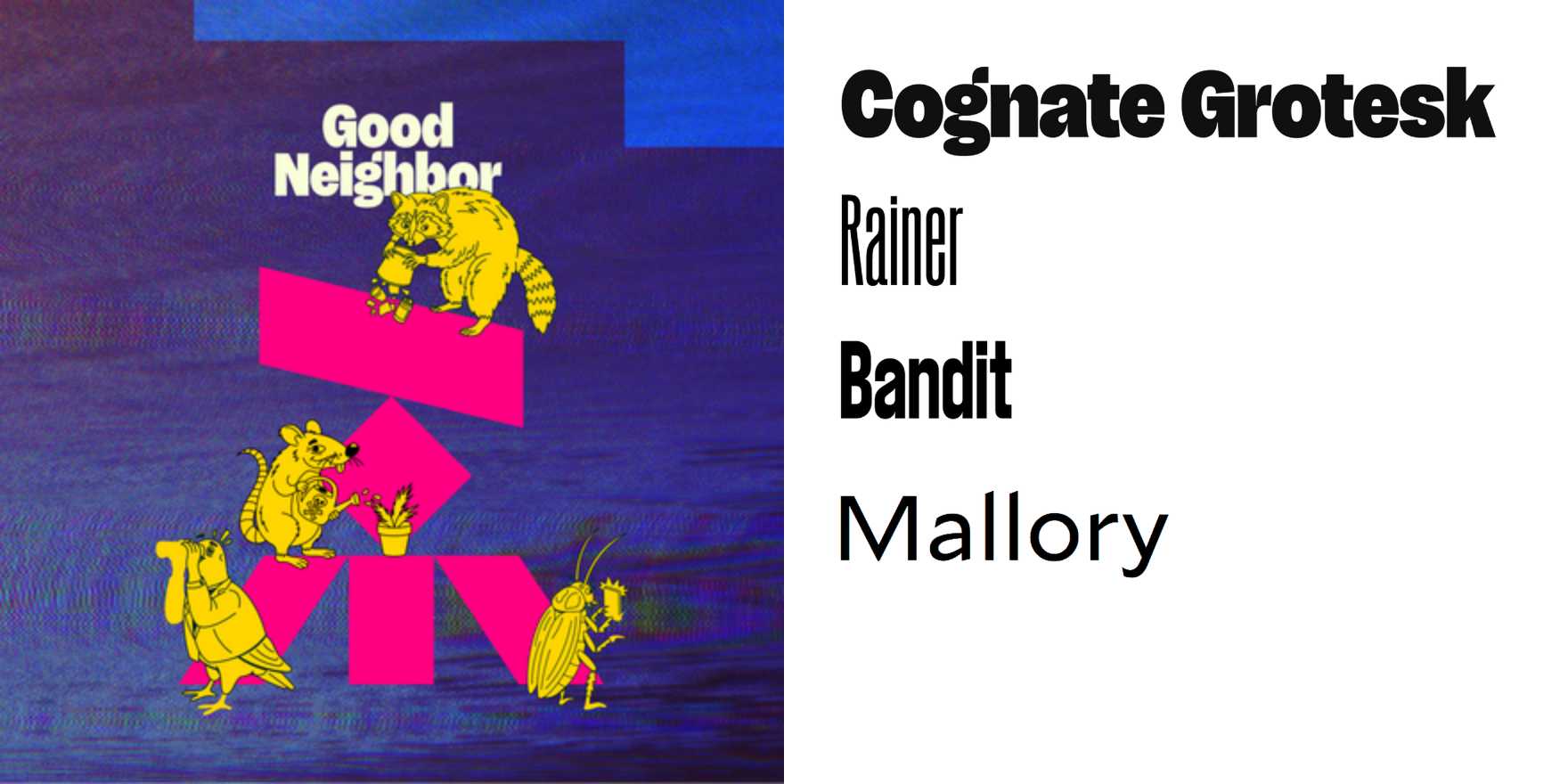
Good Neighbor event and campaign
Why It's In The Canon
The "Good Neighbor" event and campaign from Google represents a pivotal moment in the evolution of typeface usage for brand communication, especially in the digital era. This campaign showcased how typography can be leveraged not just for aesthetic appeal, but for meaningful storytelling and community engagement. The choice of Futura, a modernist typeface, highlighted its versatility and how it aligns with contemporary design sensibilities. By integrating Futura into various mediums, from website banners to in-store displays, the campaign demonstrated the power of typography in creating a cohesive and immersive brand experience. This approach to brand identity and user interface design remains relevant today, as it emphasizes the importance of selecting and using typefaces thoughtfully to enhance user engagement and build brand loyalty.