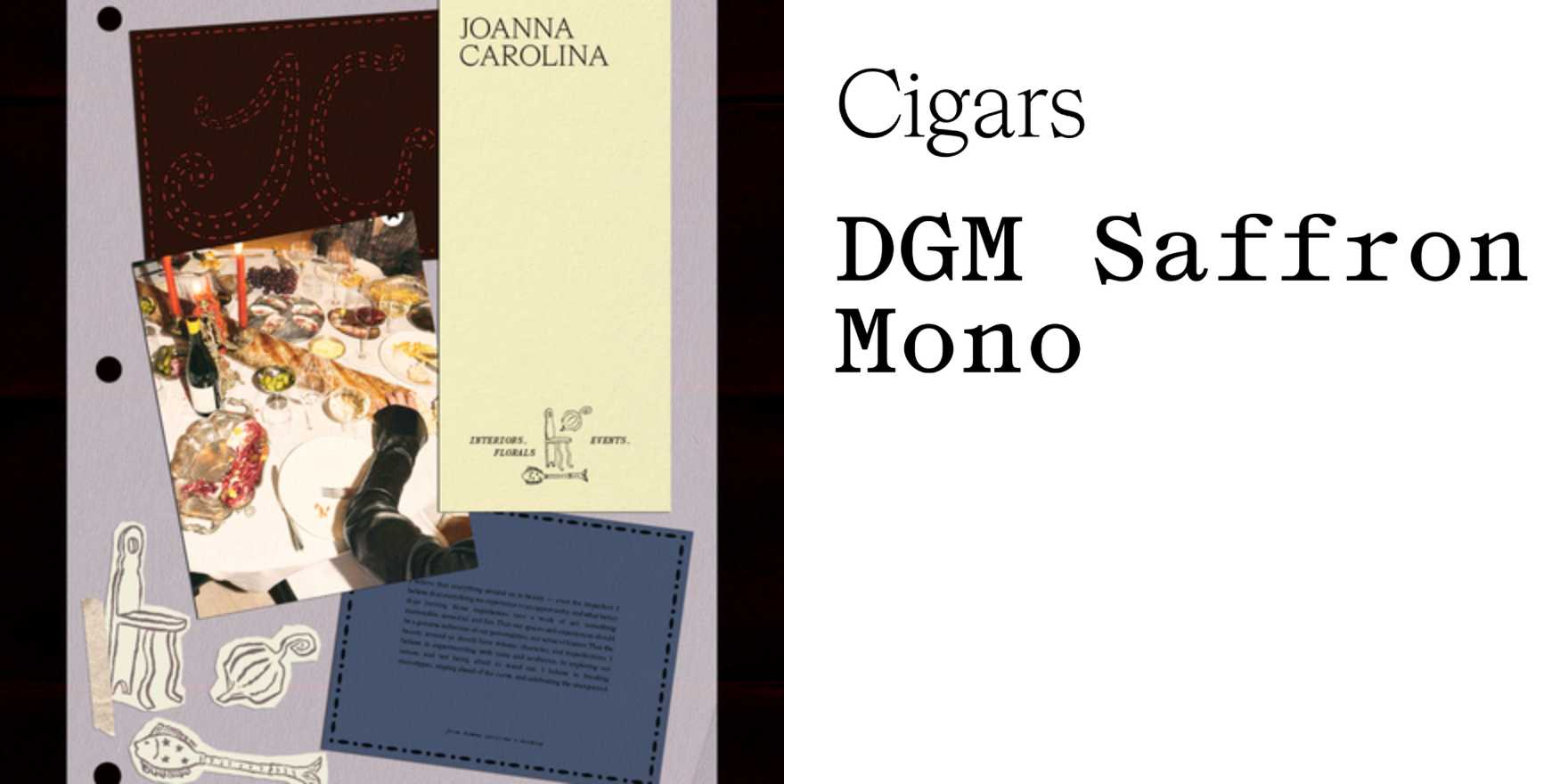
Joanna Carolina identity
Why It's In The Canon
Personal identity work done purely through type is one of the hardest things to get right because there's nowhere to hide. The Joanna Carolina identity earns its place here by demonstrating what conviction actually looks like at that scale: a name functioning as a mark, typographic hierarchy doing the structural work that most designers hand off to icons or color systems. Study the weight relationships and the tracking decisions — not as aesthetic choices but as load-bearing editorial calls. The typeface selection sits at a precise temperature: not the neutrality of a grotesque, not the warmth of a text humanist, something that reads as deliberate without announcing itself. That calibration is rare and instructive. For anyone building identity systems, design platforms, or brand tooling, this is a useful reference because type-only identities expose every weakness in a system that logomark-dependent work lets you patch over. There's no icon to carry recognition when the type fails. The fact that this one doesn't fail is the whole lesson. It also scales cleanly across reproduction contexts — screen, print, small application — which is a practical test most complex marks don't pass quietly. The discipline of suppression is what to take away: knowing what to leave out is the skill, and this identity demonstrates it without making a performance of it.


