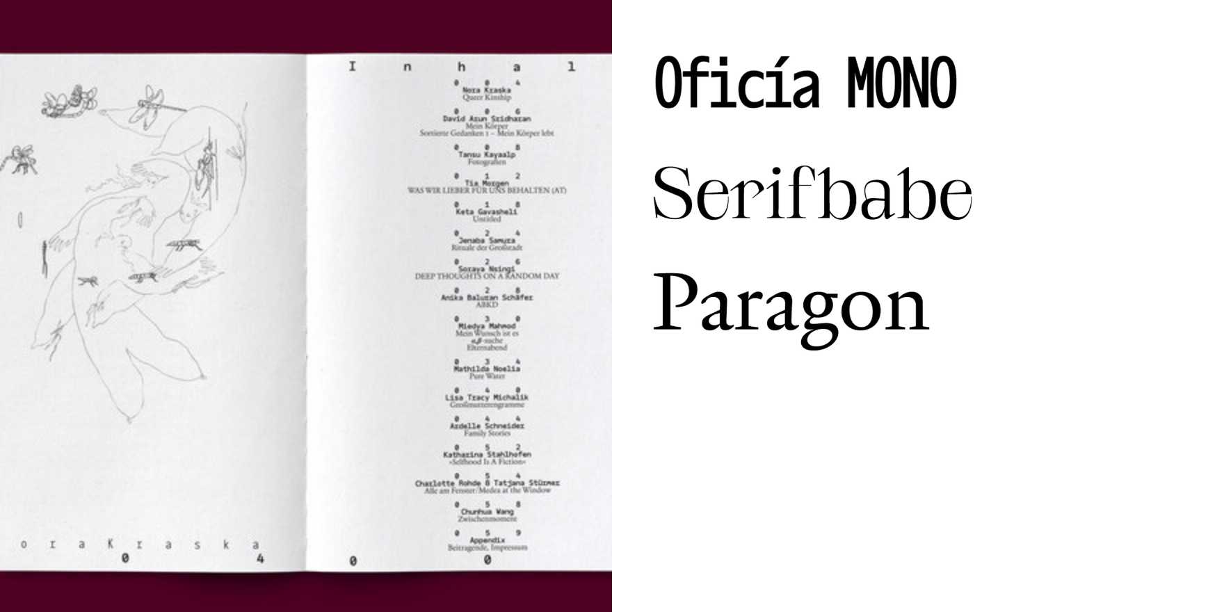
Type in Use
Korak po korak
Why It's In The Canon
"Korak po korak" is a typeface that matters because of its unique and distinctive design, which has stood the test of time. Its influence can be seen in modern sans-serif typefaces, particularly in their geometric and clean-lined qualities. For someone working on creative tooling and design, understanding "Korak po korak" provides insight into the evolution of geometric sans-serif typography. Its influence extends to web platforms and branding, where its clarity and modernity make it a go-to choice for projects aiming for a timeless, professional look. Studying this typeface reveals how simplicity and minimalism in design can achieve both aesthetic appeal and readability, critical elements in today's digital landscape.