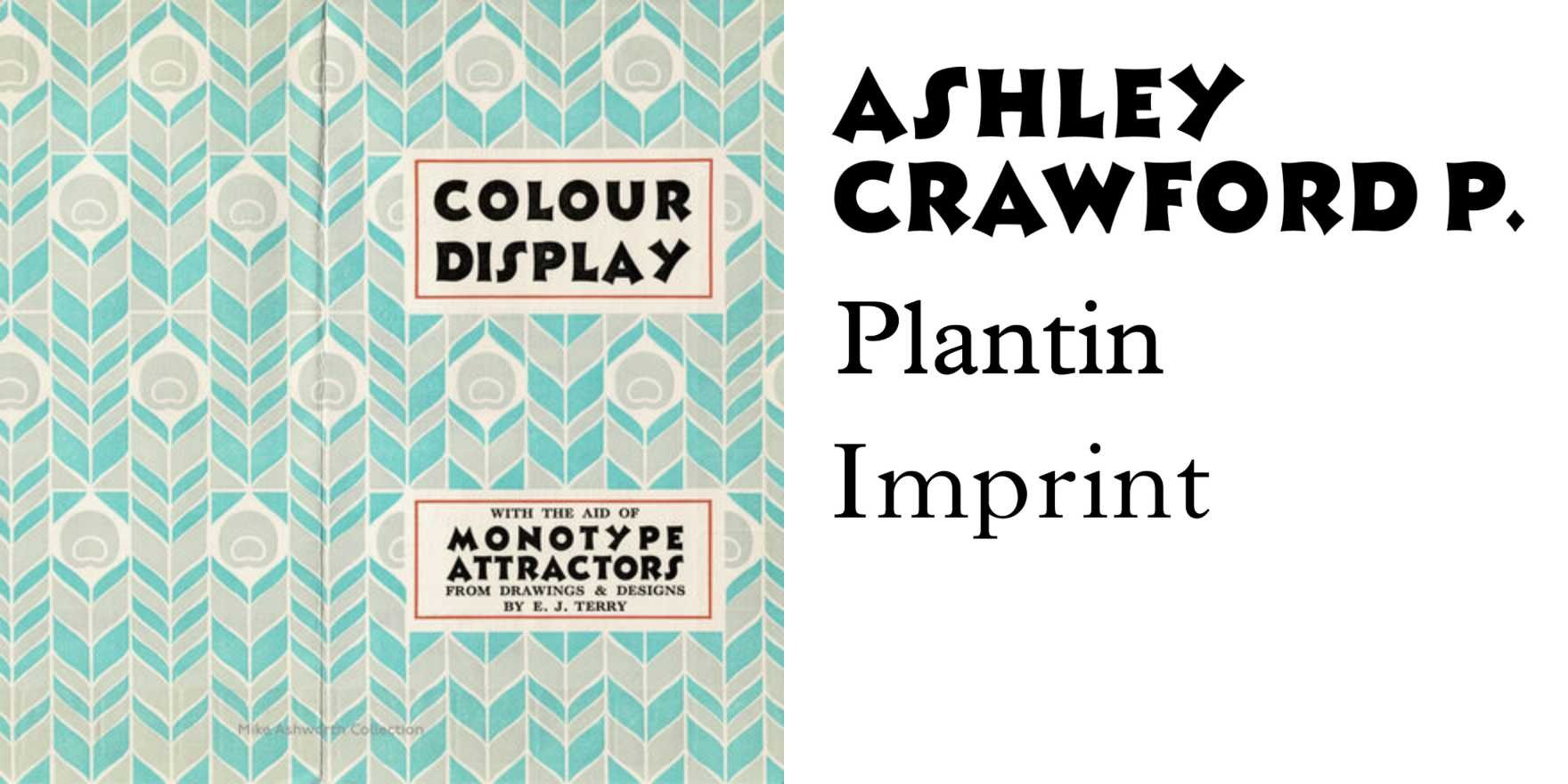
Maison Hannon
Why It's In The Canon
Maison Hannon stands as a testament to modernist typography, offering a unique blend of readability and elegance. Its designer, Hannon, aimed to create a typeface that looked contemporary yet retained a classic feel, achieving a balance that few typefaces manage. For designers working on creative tooling and web platforms, understanding Maison Hannon provides insights into the importance of legibility in digital contexts. Its geometric design and clean lines make it a versatile choice for modern branding and web design. Studying Maison Hannon can also reveal how typeface proportions and contrast influence aesthetic appeal and user experience. This typeface's enduring relevance in today's design landscape makes it essential for anyone looking to craft designs that are both timeless and contemporary.