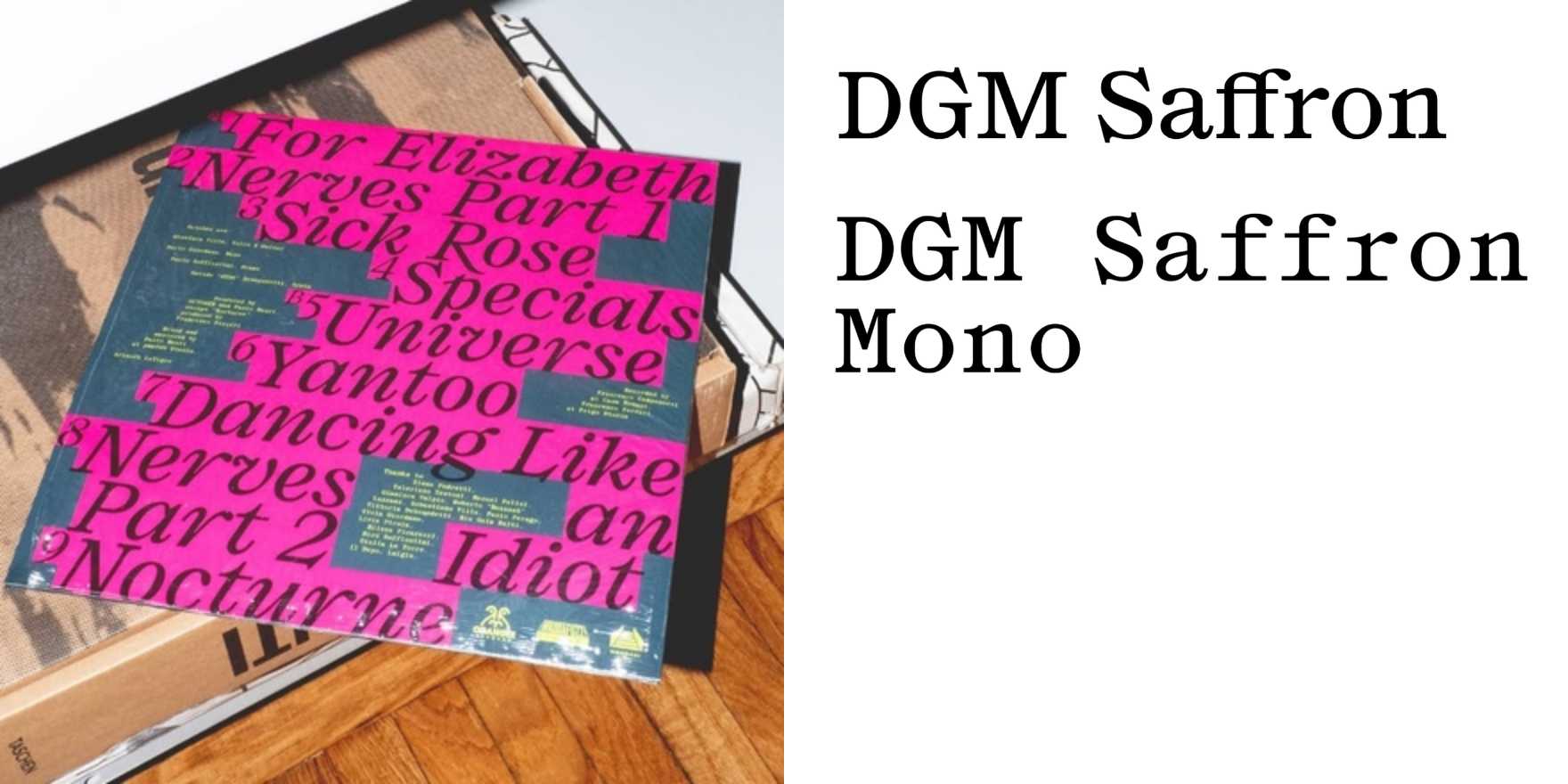
October –
Why It's In The Canon
"October –" showcases a typeface that redefines legibility through unconventional spacing and weight, challenging traditional typographic norms. Its influence on modern sans-serif design is profound, particularly in its ability to maintain readability while introducing a sense of elegance and modernity. This typeface is essential for designers working on digital platforms, especially those focusing on user interfaces where readability and aesthetic appeal are critical. The design's simplicity and flexibility make it a versatile choice for various applications, from minimalist branding to clean web interfaces. Understanding "October –" helps in appreciating the balance between form and function in contemporary typeface design, a crucial skill for anyone involved in creative tooling and branding.