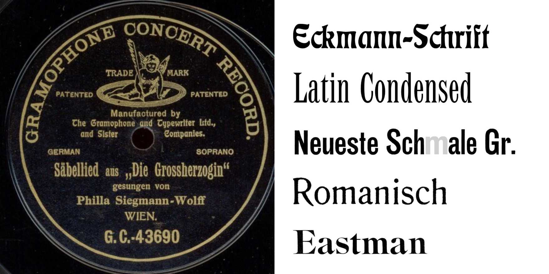
Philla Siegmann-Wolff – “Säbellied” single
Why It's In The Canon
"Säbellied," a single by Philla Siegmann-Wolff, is a notable example of experimental typography. The design employs a bold, sans-serif typeface with a unique, asymmetrical structure that mimics the shape of a saw blade. This choice of form not only emphasizes the word "säbellied" but also directly references the concept of a saw's belly, aligning with the title's imagery. The typeface's design challenges traditional notions of readability and aesthetic appeal, making it a significant piece for designers and typographers exploring the boundaries of visual communication. Its impact is especially relevant in today's digital landscape, where creative tooling and web platforms increasingly demand innovative typographic solutions to engage users and convey messages effectively.