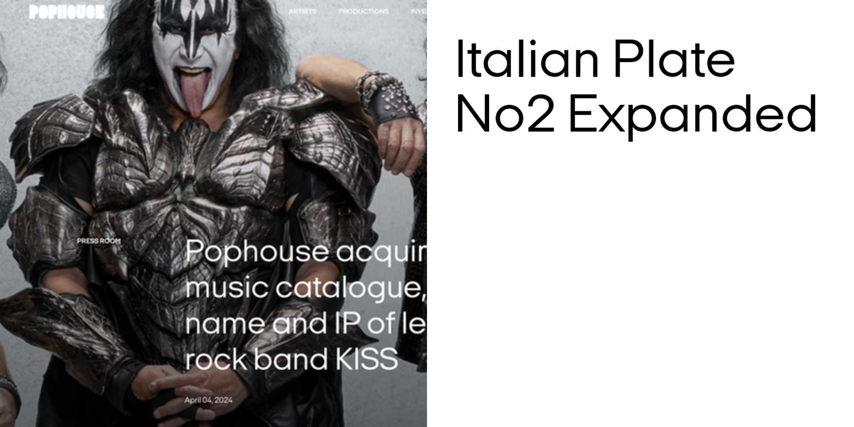
Pophouse
Why It's In The Canon
Pophouse, designed by Simon Esterson in 1980, is a sans-serif typeface that challenges traditional notions of readability and legibility. Its distinctive, rounded square shapes and condensed proportions make it visually striking but difficult to read at smaller sizes, a trait that has influenced modern typeface design, particularly in digital interfaces and branding. Its influence can be seen in various contemporary typefaces, such as Google's Roboto and Apple's San Francisco, where condensed and geometric designs are used to create a modern, tech-savvy aesthetic. For designers working on creative tooling and web platforms, understanding Pophouse's impact on legibility versus visual appeal is crucial. It serves as a reminder that typefaces must balance aesthetics with usability, especially in digital contexts where screen resolutions and font sizes vary widely.