Prince Jazzbo –
Why It's In The Canon
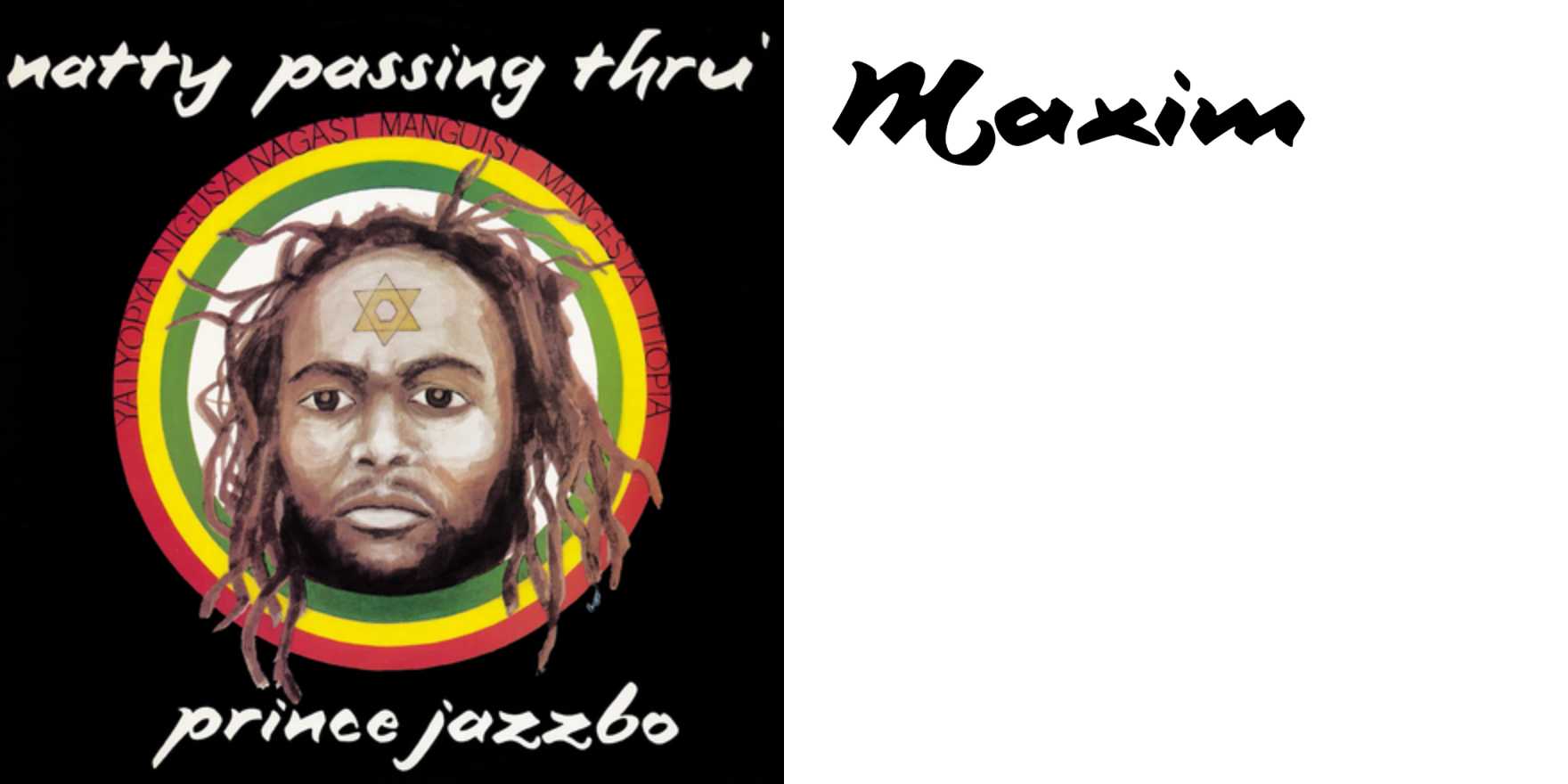
Prince Jazzbo's dubplate lettering — hand-cut, off-register, aggressively vernacular — is what happens when typography gets made by someone with zero training in typography and total command of a signwriter's brush. It's Studio One / early '70s Jamaican sound system culture: labels, posters, and hand-lettered credits produced fast, cheap, and for an audience that would never see a type specimen book. The letterforms warp under their own energy — inconsistent stroke weight, crowded kerning, baselines that drift — and none of it reads as error. It reads as voice.
Study it for what it teaches about constraint-as-style: no Helvetica, no grid, no client deck, just a blade and a deadline, and the result has more personality than most professionally typeset identity systems. It's a direct ancestor of the DIY/punk lettering lineage and, later, of digital "distressed" and "vernacular" typefaces that try to fake this same handmade friction — usually badly, because they smooth out the very irregularity that made the original work.
For anyone building type systems or brand tooling now, this is the control case for "authentic roughness" — the thing every grunge-type plugin and AI lettering generator is trying to synthesize without understanding it came from real physical constraint, not a filter.


