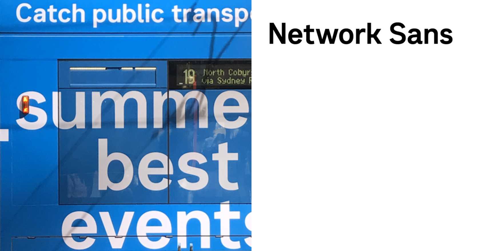
Public Transport Victoria
Why It's In The Canon
Public Transport Victoria (PTV) exemplifies modern, accessible typography that matters for designers and brands today. Its sans-serif typeface, with its clean lines and consistent character proportions, sets a standard for legibility and ease of use in crowded, high-traffic environments. The choice to avoid unnecessary decorative elements ensures that the text remains clear and readable even from a distance—crucial for busy commuters. PTV's typeface also aligns with contemporary design principles of minimalism and user-centric design, making it a practical choice for digital and print interfaces. For creative tooling and web platforms, PTV's approach to typography provides a tangible example of how design can serve practical needs while maintaining aesthetic appeal. Its influence extends to the broader design community, demonstrating that functional design can be both beautiful and effective.