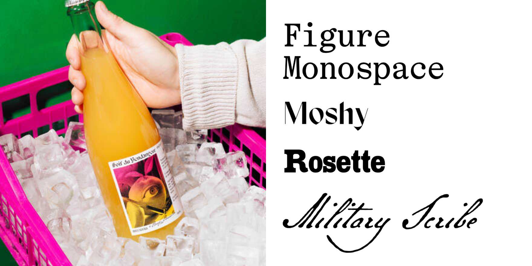
Soif du Vendangeur
Why It's In The Canon
"Soif du Vendangeur," designed by Philippe Apeloig in 2010, stands out due to its innovative approach to modernist typeface design. Its sharp, angular forms and minimalist aesthetic make it a standout in contemporary typography. The typeface's unique character lies in its interplay between geometric and organic elements, giving it a distinctive look that sets it apart from more conventional sans-serifs. For designers working on creative tooling and web platforms, it provides a powerful visual language that can convey a sense of sophistication and modernity. Its influence on contemporary type design can be seen in various digital interfaces and branding efforts, making it an essential study for anyone looking to push the boundaries of typographic design.