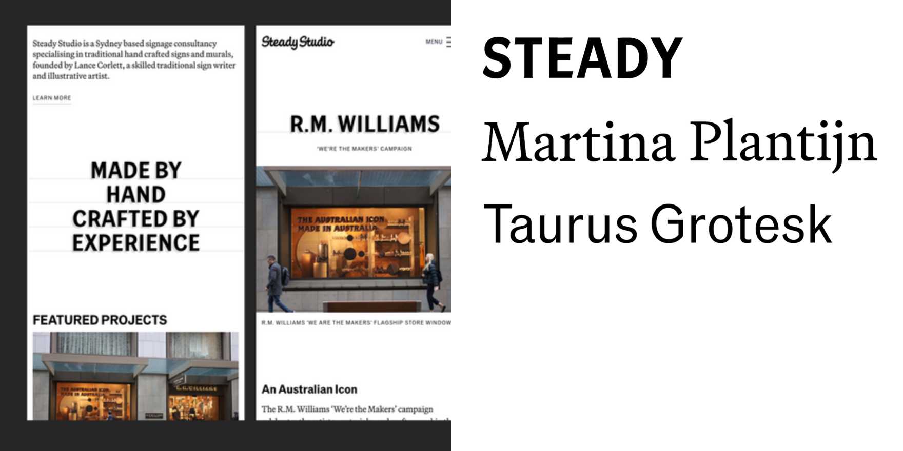
Steady Studio website
Why It's In The Canon
Proof that a website can function as an editorial object. Steady Studio treats the browser as a print surface — type scaled to structural weight, not comfort, with spacing decisions that feel made rather than defaulted. Study how they handle the relationship between display size and body: there's no decorative middle ground, no compromise weight. Everything is either load-bearing or absent. That discipline is harder to maintain in web contexts than in print, and most studios don't manage it.
The specific thing worth internalizing is the grid logic — or the apparent absence of one. Compositions read as loose until you try to replicate them and discover the underlying rhythm is exact. That gap between perceived spontaneity and actual precision is the craft lesson. It shows up in how they handle project titles against image, and in the negative space they're willing to hold without filling.
For anyone working on creative tooling, brand systems, or web platforms where type carries identity load without a sprawling asset library, this site is reference for what restraint actually looks like in production. It's not minimalism for its own sake — the choices are specific to typographic hierarchy. Influences sit somewhere between Scandinavian editorial and the harder end of Swiss rationalism, filtered through contemporary web constraints. The result is a site that ages better than almost anything built around illustration or motion trends from the same period.


