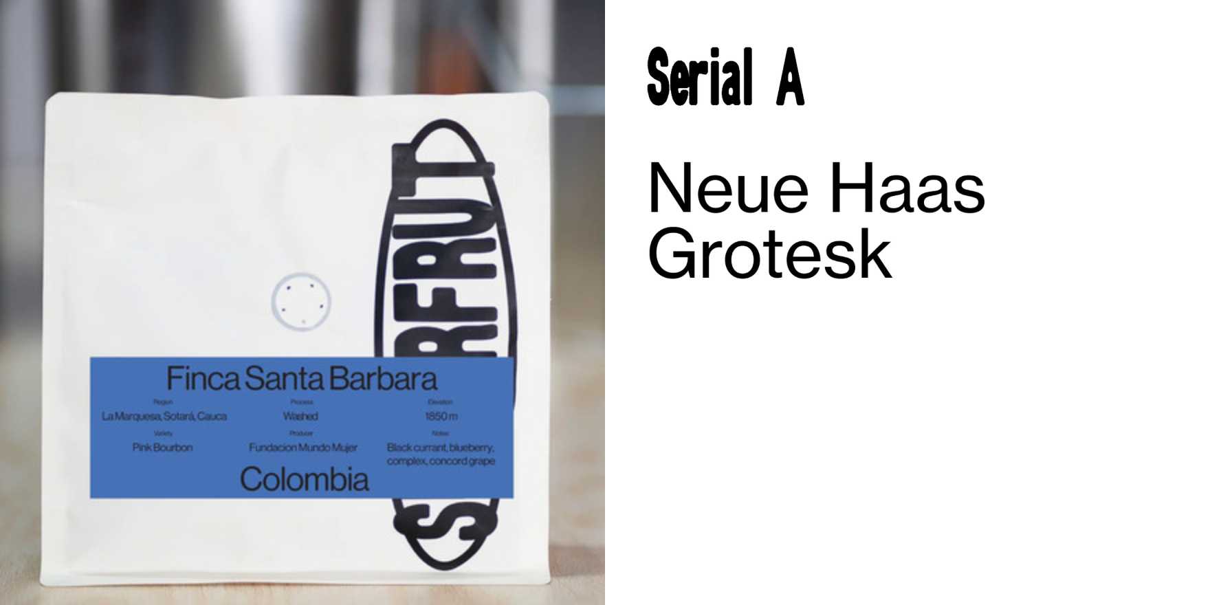
Superfrut
Why It's In The Canon
Superfrut is a typeface that stands out due to its unique, organic forms. Released in 2011, it introduced a fresh, modern take on the organic type trend. The typeface's design is characterized by its fluid curves and organic shapes, which set it apart from more traditional sans-serif or serif fonts. Its influence is felt in various design fields, from web interfaces to branding, where its contemporary yet approachable aesthetic is highly valued. For designers working on creative tooling and web platforms, Superfrut offers a robust example of how type can convey both modernity and warmth. Its popularity is a testament to its ability to blend traditional type design principles with contemporary aesthetics, making it a crucial study for anyone looking to understand current trends in typeface design.