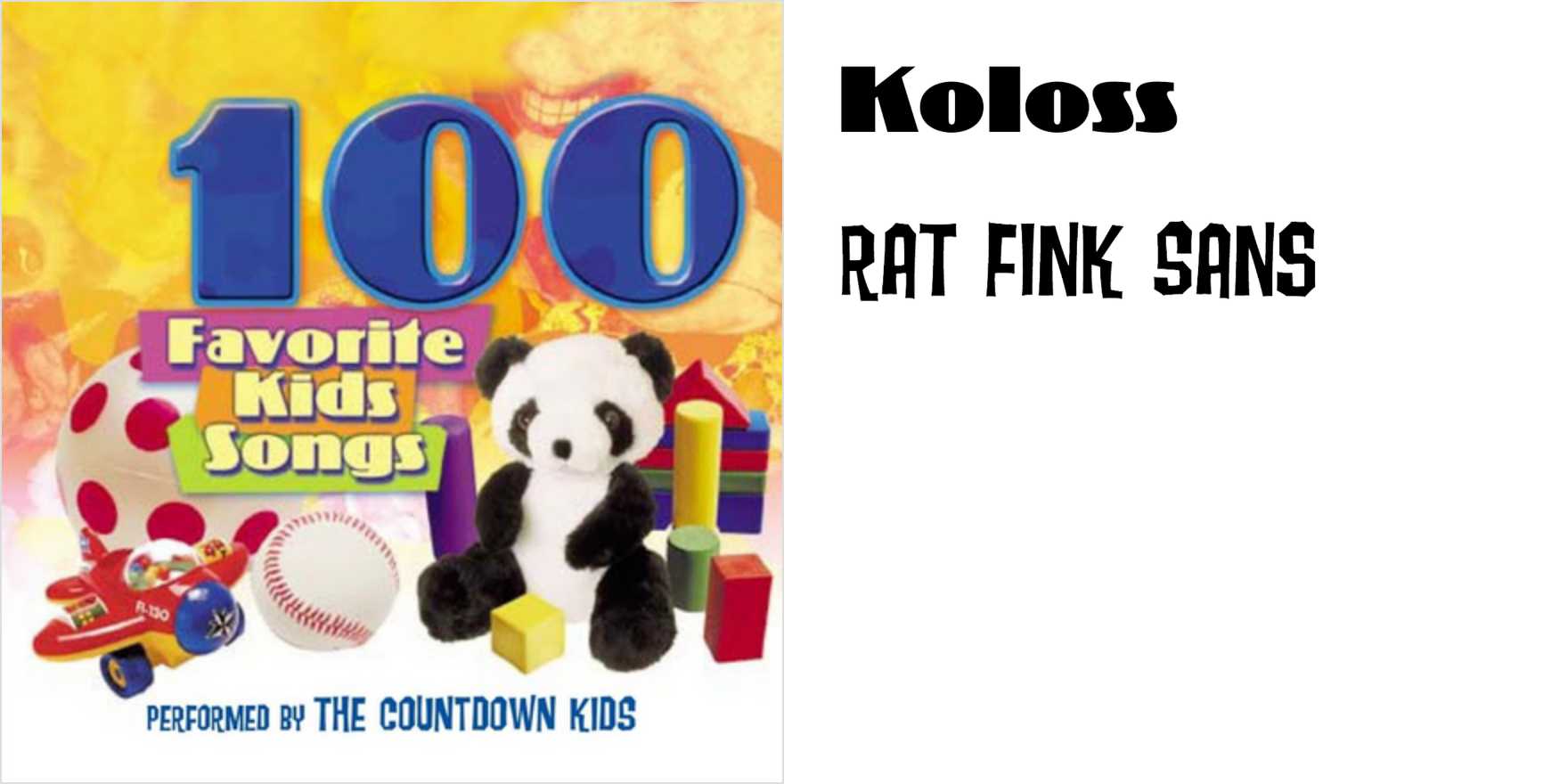
Type in Use
The Countdown Kids –
Why It's In The Canon
The Countdown Kids' typography is a pivotal example of 1990s digital typeface design. Its bold, sans-serif aesthetic reflects the emerging digital culture and the shift from analog to digital media. The typeface's angularity and simplicity made it ideal for early web design, embodying the clean, modern look that was gaining traction. Its influence is evident in the minimalist design trends that dominate today's web platforms. By studying The Countdown Kids, designers can understand the evolution of digital typography and its impact on modern branding and user interface design.