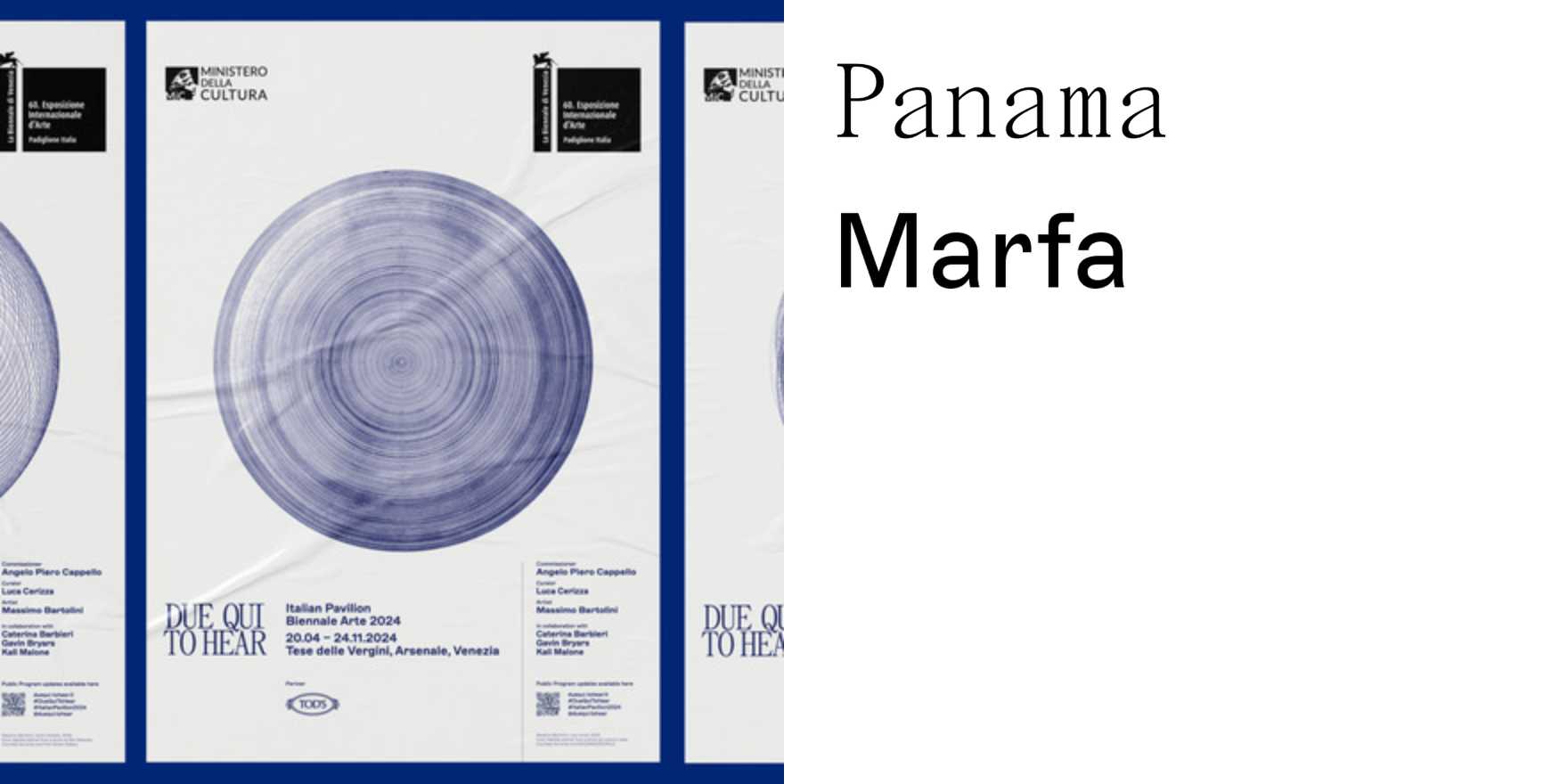
Type in Use
Venice Art Biennale Italian Pavilion visual identity and publications
Why It's In The Canon
The Venice Art Biennale Italian Pavilion’s visual identity and publications exemplify contemporary typography’s role in high-stakes design. Its clean, minimalist approach, anchored by bold, geometric sans-serif typography, ensures legibility and impact. The use of color—a restrained palette of deep blues and earth tones—mirrors the historical context while maintaining a modern aesthetic. This design’s longevity and adaptability across various mediums—from posters to digital interfaces—highlight its relevance for today’s creative tooling and branding. Its ability to balance tradition with innovation makes it a benchmark for how cultural institutions should present themselves globally.