Drawing
1977I ♥ NY
The Work
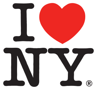
Milton Glaser sketched it on a napkin in a taxi, unpaid, for a New York state tourism board trying to rescue a city on the edge of bankruptcy. A red heart glyph between "I" and "NY". American Typewriter for the letters. That's it. It has been copied more than any logo in history.
Why It's In The Canon
A lesson in how little a successful mark needs. Four characters, one ligature-substitution (heart for love), one typeface chosen for its civic-typewriter warmth, no custom drawing. The design is almost nothing — and it survives because of that. Also: it was pro bono. Study it when tempted to over-complicate.
Formal Notes
- Rebus logic (image substituted for word) makes it readable pre-literate and in any language.
- Type choice: American Typewriter evokes official documents but at human scale (typed, not printed).
- Red heart: the only element with emotional charge. Black "I NY" gives institutional calm around the affect.
- Works at any size from T-shirt to billboard because the three elements carry equal weight.
Connected To
- Milton Glaser — creator (add this entry)
- Aicher Munich '72 — opposite end of the scope spectrum, same year-ish


