Print
2015Quebec Ski Centre
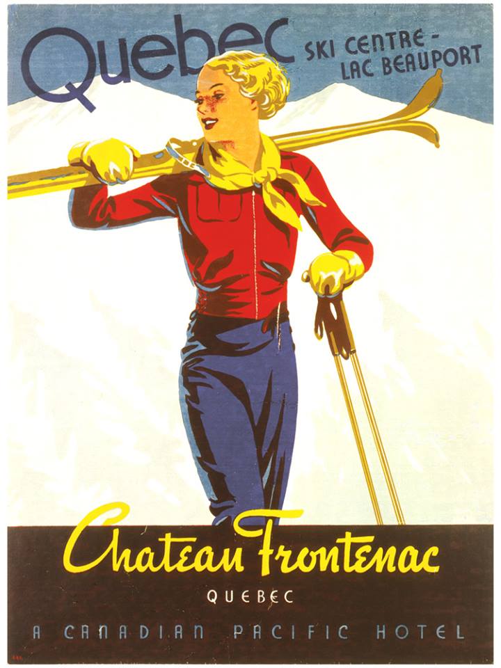
The composition is dynamic, featuring a central figure in action, framed by the diagonal lines of the skis and poles. The text is structured in distinct blocks, with the main title 'Quebec' dominating the upper left, balanced by the location details. The use of strong color blocking and bold typography gives it a commercial, promotional feel.
The style suggests commercial illustration typical of the 1920s-1940s, utilizing flat planes of color and simplified, stylized figures characteristic of early modern advertising art. The printing technique is likely lithography.

