Identity
1994FedEx — Hidden Arrow
The System
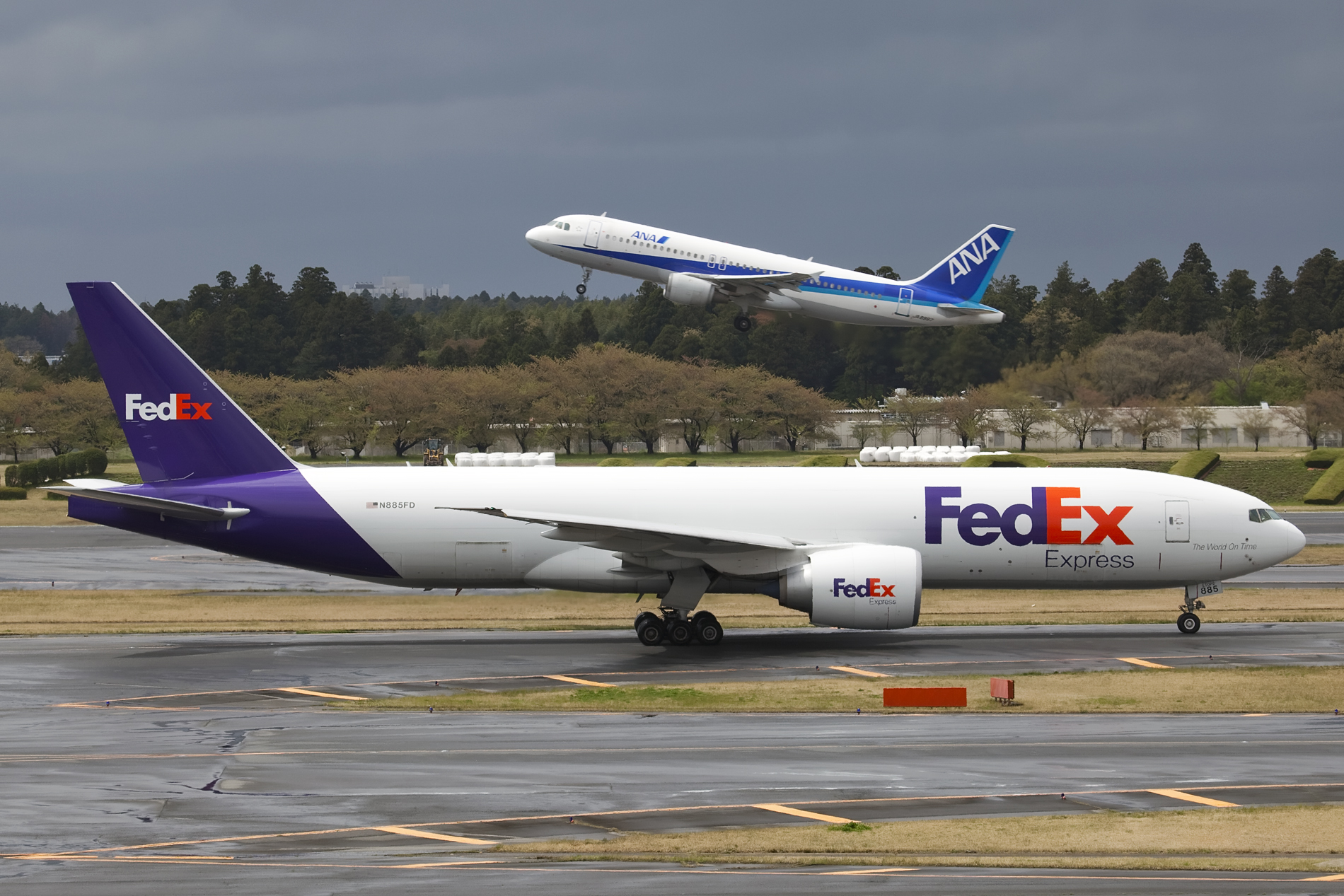
Lindon Leader's 1994 redesign of the FedEx wordmark. The innovation: a right-pointing arrow formed in the negative space between the lowercase "E" and "x". A logistics company's single required idea — forward motion — encoded in the typography itself, not in a separate symbol. A custom ligature built from Univers (modified) and Futura Bold.
Anatomy
- Wordmark only. No separate icon. This is its discipline.
- Custom letter spacing between E and x to create the arrow negative space — nowhere else.
- Purple for "Federal" heritage, orange for "Express" energy. Later divisions swap the orange (red for Ground, green for Home Delivery).
- Works in single-color reproduction because the arrow is geometric, not chromatic.
Why It's In The Canon
The gold standard of identity as concept-not-decoration. A logistics brand has one job (move things there). The logo performs that job every time someone reads it. Study when tempted to make a "clever" logo — clever usually means visible trick; FedEx is invisible trick, which is harder and lasts longer. Millions have seen the logo; most never notice the arrow until told.
Connected To
- NBC Peacock — another negative-space identity


