C. Tangana –
Why It's In The Canon
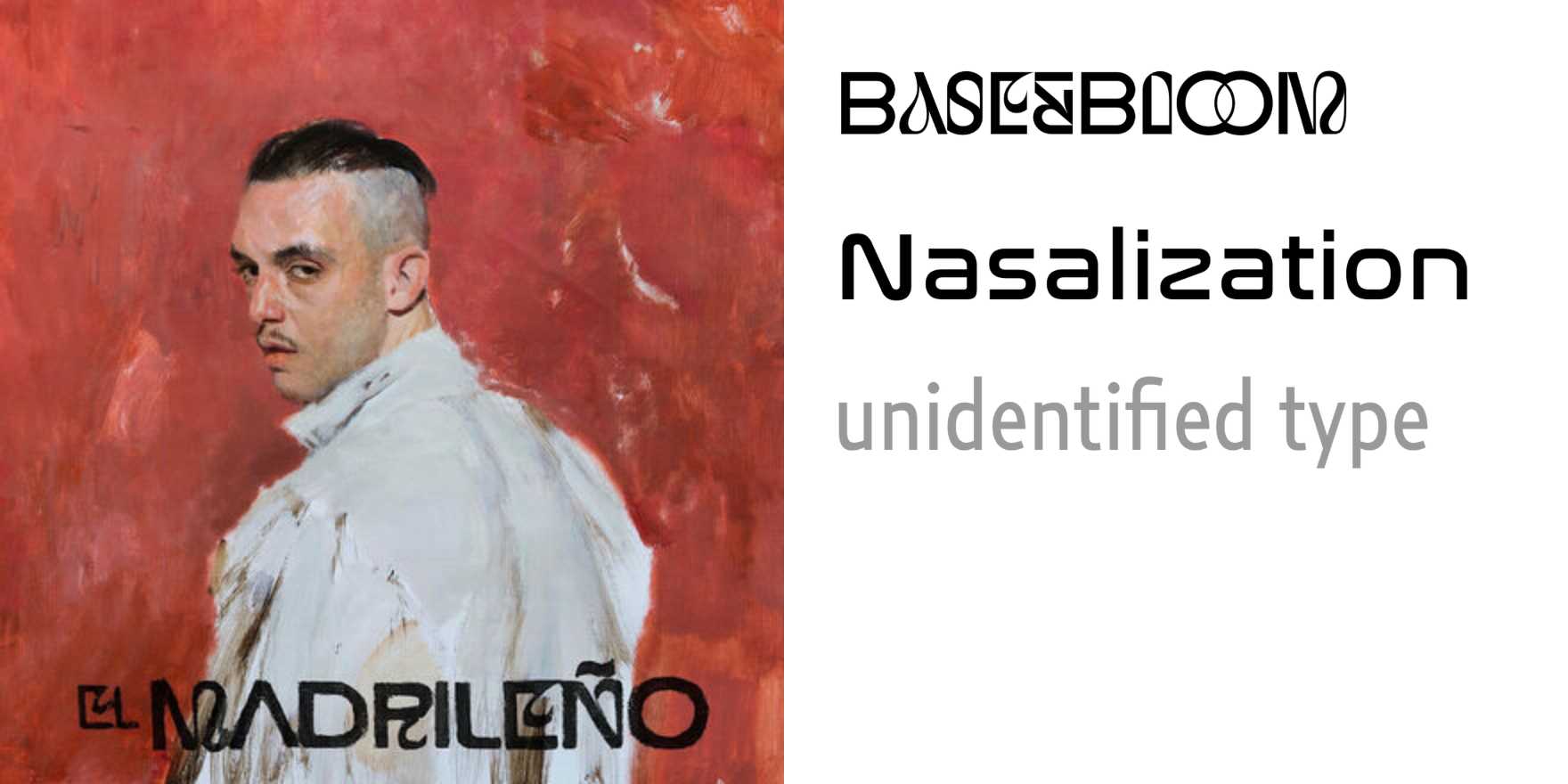
The El Madrileño campaign is a masterclass in using typeface selection as cultural argument. The visual team leaned hard into aged Spanish newspaper serifs — the kind of letterforms that carry decades of tabloid grit and Catholic iconography — and planted them inside a contemporary pop context without irony or apology. The effect was a reclaimed traditionalism: old Spain aesthetics stripped of their conservative freight and repurposed as a statement of identity. That move is exactly what designers building platforms with cultural specificity need to understand. Type isn't neutral decoration; it's a shorthand for who a thing belongs to.
Study the album covers and merchandise against the music videos. The type choices hold across wildly different media contexts — which means the system was designed, not improvised. There's also real craft in the weight decisions: nothing feels retrofitted or cosplay-Spanish. It reads as owned. For anyone building brand systems for platforms where cultural identity matters — diaspora products, arts infrastructure, anything trying to signal "this is from somewhere specific" — Tangana's visual language shows how to do that without flattening into heritage pastiche. The lesson isn't the aesthetic itself; it's the coherence between typographic register and the cultural claim being made.


