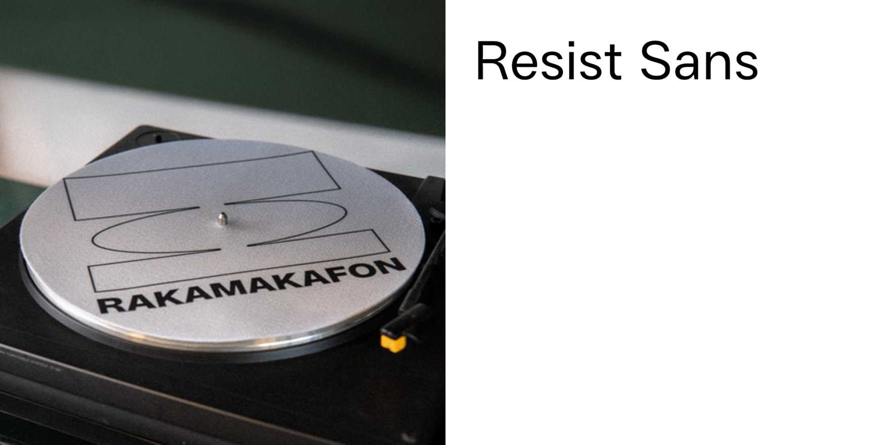
Rakamakafon
Why It's In The Canon
Rakamakafon earns its place here not as a curiosity from Istanbul but as a demonstration that type-in-use can carry cultural specificity without illustration or ornament — the letterforms alone do the work. What the studio does consistently is hold two scripts in tension (Latin and Arabic/Ottoman) without subordinating one to the other, which is a harder problem than it looks and one that most Western type practice simply avoids. The result is work where the hierarchy isn't imported from European editorial conventions; it's built from scratch for the material.
Study the scale decisions specifically: how they use mass and negative space to create rhythm across a spread or screen before your eye resolves the individual glyphs. That's a skill transferable directly to web layout and UI type systems, where most designers default to size and weight alone. The cultural literacy angle matters too — if you're building platforms that ever touch MENA, South Asian, or Turkic markets, you need a working model of what multi-script design that isn't apologetic actually looks like. Rakamakafon provides that model. The work also pushes back implicitly against the idea that "global" design means neutralized design — every piece is rooted somewhere specific, which is what makes it legible and distinctive rather than generic.


