Paul Cauthen –
Why It's In The Canon
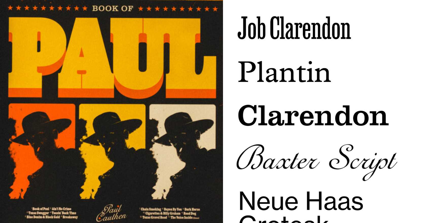
The typographic language across Paul Cauthen's releases — particularly Country Coroner and Room 41 — is worth studying because it does something specific: it borrows from American vernacular type traditions (funeral parlor gothic, gospel broadside, roadside Western) without becoming costume. The slab serifs and condensed gothics aren't deployed ironically or as nostalgia bait. They're chosen for tonal weight — the ability to hold grief and swagger in the same letterform. That's the real lesson here. Genre typography almost always collapses into pure signaling: you see the font and you already know what it means. Cauthen's visual work resists the shortcut. The type earns its register rather than borrowing it.
For someone building on cultural platforms or working in brand systems, the study is about vernacular credibility — how historical type systems carry accumulated meaning that no neutral geometric sans can approximate, and how to deploy that weight without tipping into kitsch. The risk in this territory is always pastiche; the execution in these releases avoids it by treating type as tone, not decoration. Watch the leading, the case choices, the specific moment the letters stop being read and start being felt. That threshold is where most brand typography fails, and where this succeeds.


