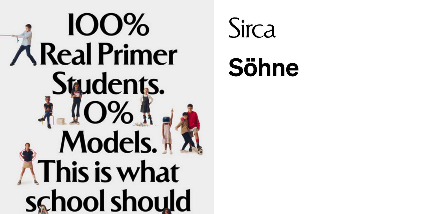
Primer
Why It's In The Canon
The name earns its place. A primer is what you read before you know what to look for — and type that deserves this label doesn't perform, it instructs by being so clear that instruction disappears. Study the spacing decisions, the counters, the way the typeface holds legibility across scale: display to caption, headline to UI label. That range is technically demanding and rarely executed without compromise somewhere.
What puts it in the canon is the restraint. Most reference typefaces teach through personality; this one teaches through logic. The lineage is readable: DIN's engineering inheritance, Swiss editorial discipline, the information design tradition that runs from Frutiger's airport wayfinding through the systematic thinking behind contemporary design tokens. The influences aren't decorative — they're structural, and they show up in the places where amateurs cut corners: optical spacing at small sizes, weight distribution across a full family, behavior when set tight in a grid versus loose in long form.
For anyone building interfaces, brand systems, or editorial platforms where type has to carry meaning without announcing itself, this is the control case. The lesson isn't "use this typeface" — it's to understand why it was chosen here, for this audience, at this scale. Asking that question before reaching for a font is what separates typographic thinking from typographic decoration.


