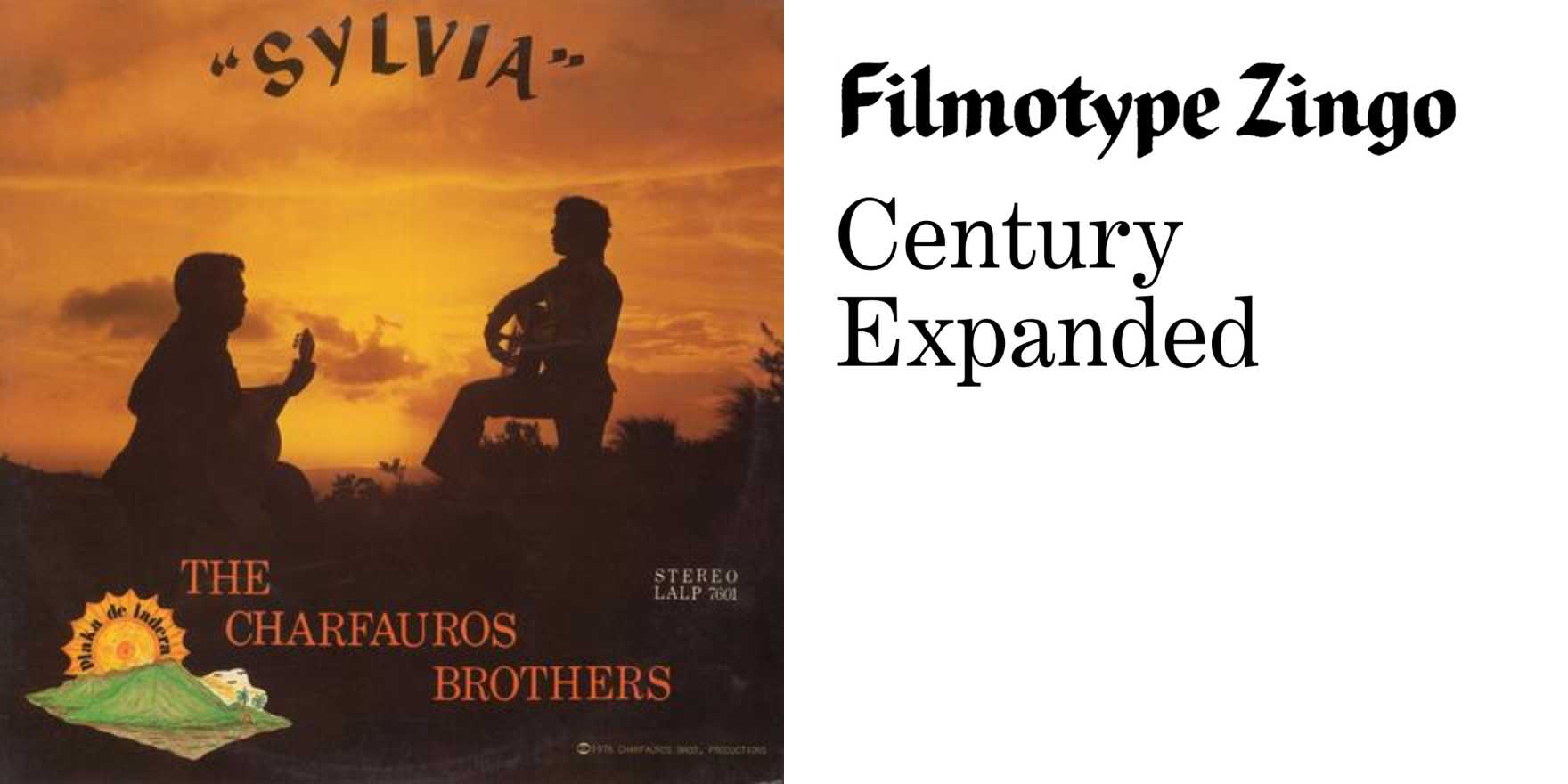
The Charfauros Brothers –
Why It's In The Canon
Vernacular lettering beats systematized type at teaching what type is actually for. The Charfauros Brothers work in the sign-painting tradition — hand-cut, hand-brushed letterforms built for a specific wall, specific light, specific read-speed from a moving car — not a typeface designed to scale infinitely across a brand system. Study the constraints: no kerning pairs, no OpenType features, just a brush, a straightedge, and an eye trained by repetition. Drop shadows are structural, not decorative — they're how you make a letter hold up against sun glare and distance. Ligatures happen because two strokes are faster than four, not because a type designer programmed a contextual alternate.
This matters now because most people learning type today learn it inside Figma, choosing from a dropdown of infinitely adjustable weights and never touching the physical constraints that produced the vocabulary they're borrowing — the swash, the tapered stroke, the outlined fill. Sign painters like the Charfauros Brothers are a direct line to Chamorro and broader Pacific vernacular commercial lettering, a tradition largely undocumented in Western type history and absent from the usual canon of Herb Lubalin and Ed Benguiat. Put it next to any contemporary "hand-lettered" branding project and the difference is obvious: one is solving a real problem with real tools, the other is simulating the aesthetic of that solution in a vector program. Know the difference before you fake it.


