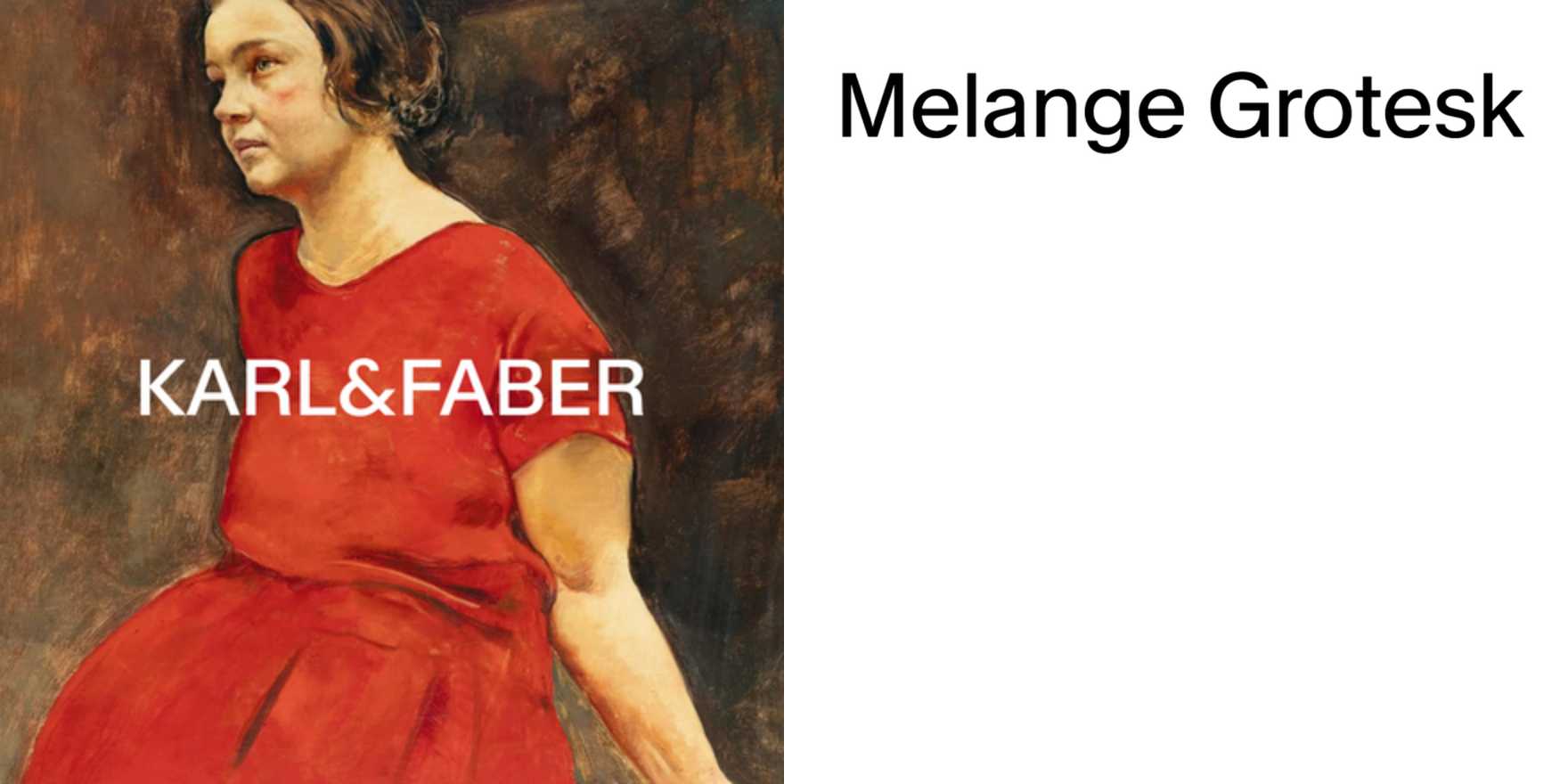
Karl & Faber
Why It's In The Canon
Karl & Faber's printed matter — auction catalogs, lot sheets, correspondence — is among the cleanest examples of German commercial typography working at full confidence. No decorative pressure, no branding anxiety. Type carries everything: authority, hierarchy, trust. The catalogs use classical serif faces set with the kind of white-space discipline that contemporary digital design keeps rediscovering and then over-explaining. Study the column widths and the way running headers sit against lot descriptions — decisions made without a design brief, just accumulated house judgment over decades.
What's worth taking from it now is the relationship between scarcity and density. These are catalogs for rare objects, and the typography performs rarity without theatrics. Thin rules, precise leading, type scaled for reading not scanning. The functional constraint — buyers need clear provenance, dates, condition notes — forced a hierarchy that feels almost invisible. That's the lesson: type_in_use at this level isn't styled, it's solved. For anyone working on platforms where content has inherent weight (archival tools, institutional interfaces, anything that needs to feel permanent), Karl & Faber is a reference for how restraint accumulates into character without ever announcing itself.


