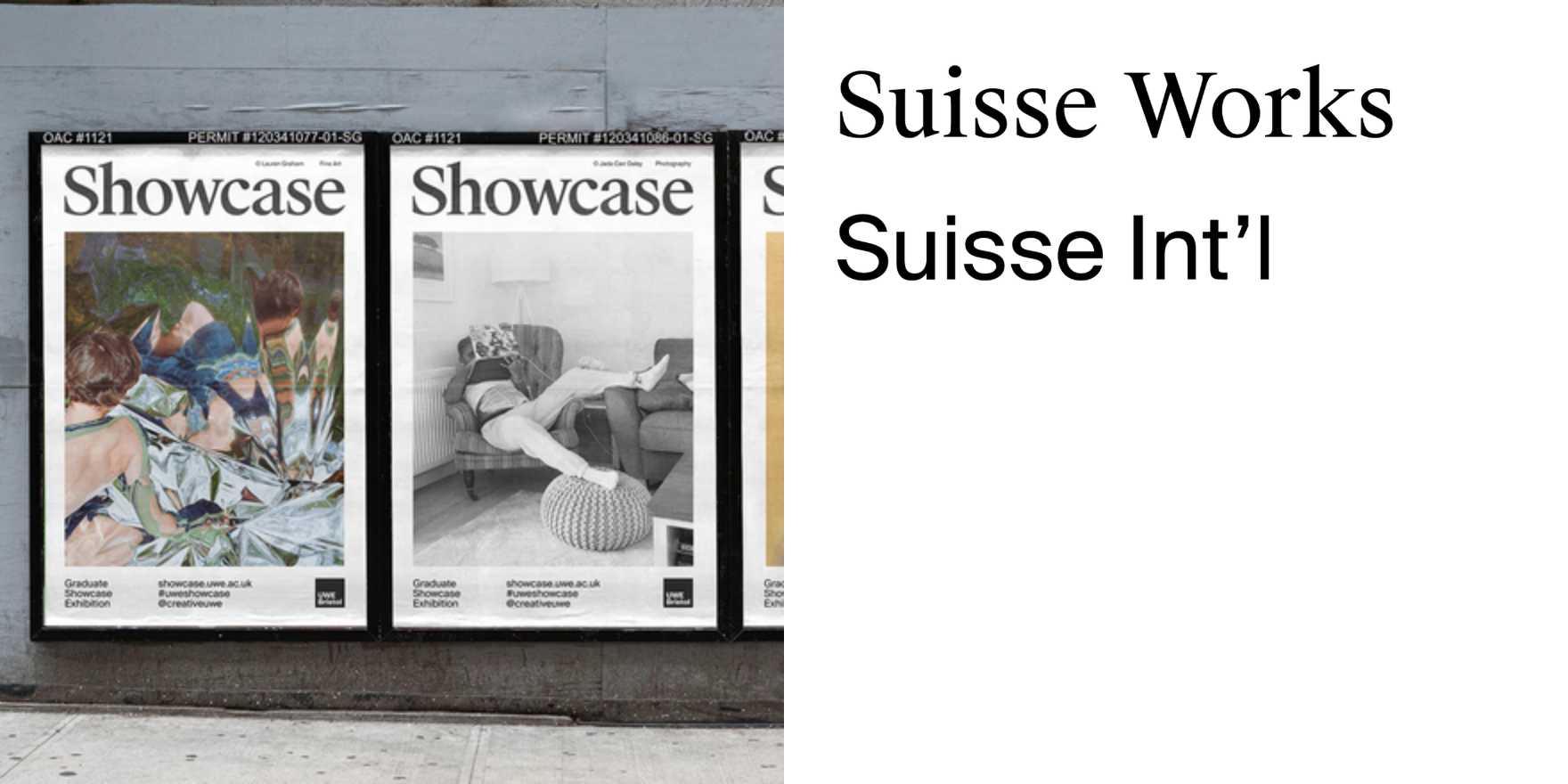
Showcase, UWE Bristol
Why It's In The Canon
UWE Bristol's Showcase runs against the dominant mode of student design publications — no safe Swiss revival, no pastiche modernism. The typographic decisions are load-bearing: hierarchy built through spacing and rhythm rather than weight alone, display sizes calibrated against body tracking in ways most editorial work gets wrong. Worth studying specifically for how it handles the transition zones — header to subhead to body — where most publications either go too heavy or collapse into visual flatness.
For anyone building content systems, design tools, or brand frameworks, this is a reference point for editorial typography under real constraint. Fixed format, limited palette, multiple contributors, variable content length. The grid is legible in the work — you can reverse-engineer the decisions, which is what makes it useful. It's not typography performing difficulty; it's typography doing structural work quietly.
The specific things to study: how type alone establishes section breaks without relying on rule lines or full bleeds, how tracking shifts signal register changes, how a student publication can have a consistent typographic voice without a brand system propping it up. Institutional publishing at this level teaches what screen-native design often can't — that type decisions compound across a document, and that the reader feels inconsistency before they can name it.


