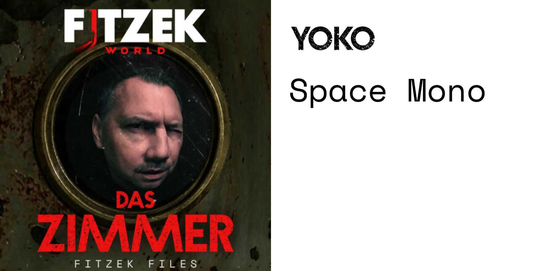
Fitzek World website
Why It's In The Canon
The Fitzek World site earns its place not because it's flashy but because it treats type as architecture — every structural decision is made through letterforms first, layout second. The hierarchy is built entirely through weight, scale, and tracking rather than color or ornamentation, which makes it a clean case study in how far typographic contrast alone can carry a page. What's worth studying specifically: how the display type sets spatial rhythm before the eye reads a single word, and how that rhythm survives scroll — the grid doesn't collapse into mobile slop, it adapts with the same intention intact.
For anyone building editorial-adjacent platforms, branding systems, or design tooling interfaces, this is the kind of reference that sharpens the eye for what's actually being done when type "works." It sits in a lineage of German editorial design — reduced, controlled, confident in negative space — but it delivers that sensibility through web constraints without apology. The lesson isn't the aesthetics; it's the commitment. Most web typography hedges. This doesn't. The things to steal: how leading and tracking choices communicate brand register before brand color does, and how a limited typeface palette (probably two cuts, maybe one) generates more variety than most sites achieve with five families.


