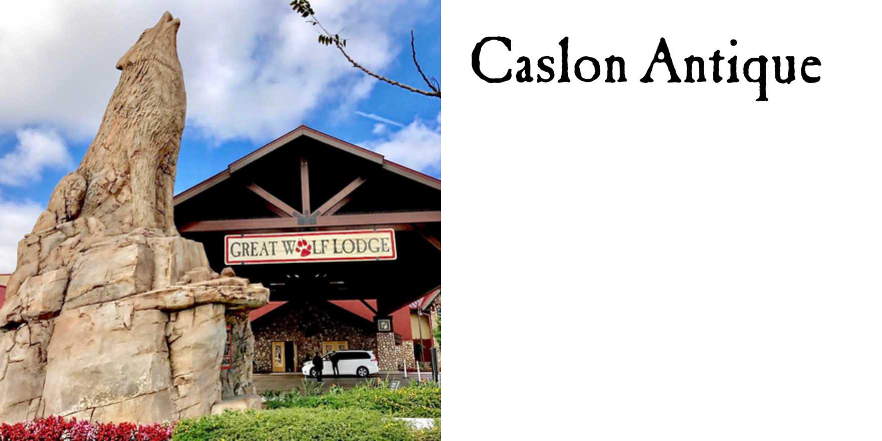
Great Wolf Lodge
Why It's In The Canon
The Great Wolf Lodge wordmark is a masterclass in applied trust engineering through type. That chunky, slightly condensed serif — warm enough to feel handcrafted, legible enough to work at 40 feet on a building façade — is doing precisely the work that the whole resort concept requires: it needs to read as lodge (rustic, earned, cozy) while operating at full corporate-chain scale. Study how the letterforms balance weight and optical warmth; the ink traps and slightly beveled quality suggest woodcraft without literally being a wood sign. This is the same problem every "authentic" brand at scale has to solve, and most fail by going either too cold or too costumey.
What makes it worth keeping in a type canon is the environmental pressure it's designed under. This type lives on wristbands, towels, 80-foot exterior signs, loading screens, and foam noodles simultaneously. The system holds. For anyone building platforms or brand systems where type has to survive hostile surface conditions — dark mode, embroidery, small screens, physical merchandise — this is a real-world stress test worth reverse-engineering. The specific influences are American National Park signage, mid-century resort lettering, and WPA poster typography, all degaussed for a family market. The lesson isn't the aesthetic. It's the discipline of making warmth scale.


