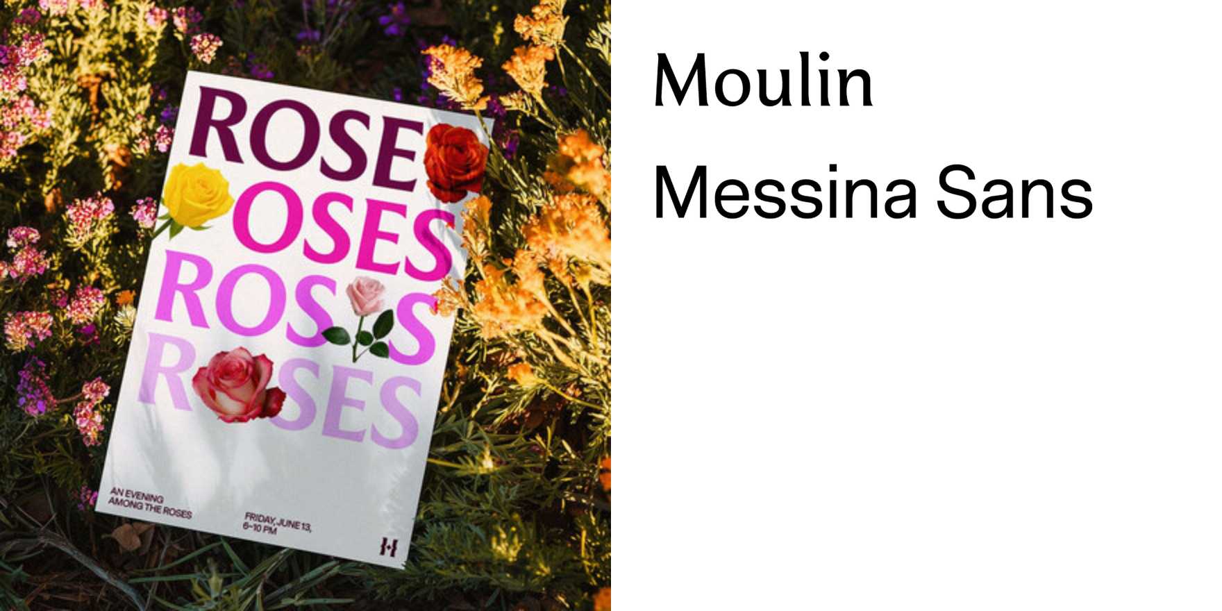
The Huntington
Why It's In The Canon
Few institutions carry the kind of typographic credibility that The Huntington earns by default — the collection includes medieval manuscripts and early printed books that are the literal origin point for the letterforms designers license today. That genealogical weight matters when you study how the institution presents itself: the editorial decisions in their publications, the restraint in their wayfinding, the specific way classical serif choices get deployed against garden signage and archival contexts without tipping into pastiche or stiffness. What to study: how the hierarchy works at the physical scale of the garden versus the intimate scale of print, how institutional branding absorbs historical gravity without performing it, and how serif type functions as a signal of permanence rather than nostalgia when the context earns it.
For anyone building in the cultural or archival adjacent space — platforms, tooling, branding systems for creative or academic work — The Huntington is a pressure test for how type carries authority. The trap is treating "serious" as synonymous with heavy, formal, or slow. The Huntington sidesteps that. The choices read as considered, not constrained. That distinction is operationally useful: it shows how you build trust through typographic economy rather than typographic volume, which is the actual problem in web and product contexts where institutional credibility is being established through a screen, not a garden.


