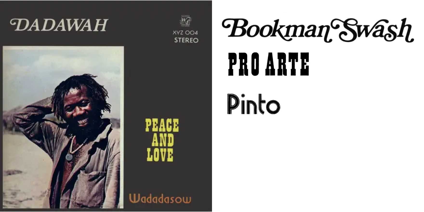
Dadawah –
Why It's In The Canon
Vernacular spiritual typography rarely survives intact into design discourse. Dadawah's printed material sits at a junction most canonical type specimens don't reach: letterforms that operate inside a belief system rather than a brand system, where the text is devotional object first and layout problem second. The forms carry weight that isn't resolved by legibility optimization or grid compliance — it comes from context saturation.
What to study: the relationship between text-as-scripture and text-as-surface. The rhythm of setting that answers to something other than a baseline grid. The way density and register function as meaning-carriers independent of formal refinement. This is the live edge of what "type-in-use" as a category can do — show letterforms under pressures that the modernist and commercial specimens don't apply.
For someone working on creative tooling or design platforms, the risk is building a typographic reference canon composed entirely of Swiss modernism, editorial design, and tech-adjacent branding, which produces a narrow definition of what good typography looks like across cultural registers. Dadawah is a corrective. The expressiveness here — the hand-register, the spiritual density, the refusal of optimization — is a counter-model worth holding when the question isn't "does this scale?" but "does this carry anything?" Those are different questions, and most design systems only know how to answer the first one.


