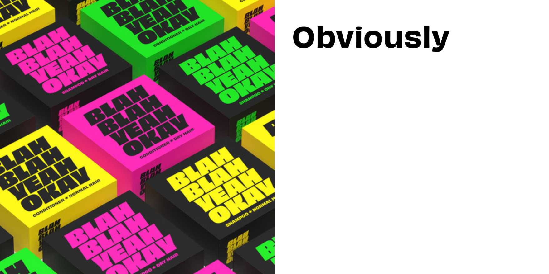
Blah Blah Yeah Okay
Why It's In The Canon
Casual speech has always been typography's uncomfortable subject — the formal grid versus the slurred, the compressed, the "whatever." This piece earns its place by treating throwaway language as the actual design problem: how do you set words that are trying to sound like they don't care? The answer reveals more about the relationship between tone and letterform than most serious typography ever does. Study the spacing decisions — they're doing emotional work, not just optical work. Study the weight choices: too heavy and the dismissiveness reads as aggression; too light and it collapses into actual apathy.
What makes it load-bearing for someone building interfaces or brand systems right now is this: the whole register of contemporary digital communication is blah blah yeah okay. Slack messages, UI microcopy, error states, empty states, onboarding flows — they all want to sound human and low-stakes, and most of them fail because the type is set like a business card. This piece shows what it actually takes to make a letterform carry that tone without irony becoming parody. If you're setting voice and tone guidelines, or choosing a typeface for a product that wants to feel approachable without being cloying, you need to understand how this works at the letterform level — not just the word level. The name isn't the joke. The name is the brief.


