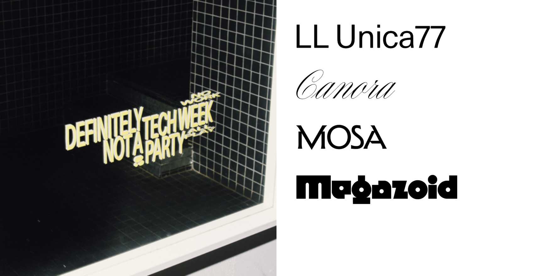
Definitely Not a Tech Week Party
Why It's In The Canon
The title is already doing half the design work. That sardonic distance — naming a thing by what it refuses to be — is a rhetorical move encoded in type before a single letterform appears. What makes this a useful study isn't irony as decoration; it's irony as structural logic, where the typographic choices have to earn the same skepticism the name already promises. Too clean, and it looks like the tech party anyway. Too crude, and it's just cosplaying underground. The work lives or dies on how well the type holds the tone.
Study it for the gap between the institutional register it's deliberately not using and whatever texture the actual setting carries. That friction is where the cultural literacy lives. For anyone building tools that sit adjacent to the startup world — design platforms, creative SaaS, branding systems — this is the exact decision space: how do you signal intelligence and cultural seriousness without cosplaying either the Bay Area optimism aesthetic or its mirror-image ironic detachment? The piece demonstrates that type choice IS cultural positioning, not just stylistic preference. The weight, the spacing, the choice to set something humanist vs. grotesque vs. display — each one is a declaration. This belongs in the canon because the lesson generalizes fast: every interface, every header, every product wordmark is also, quietly, saying what it's definitely not.


