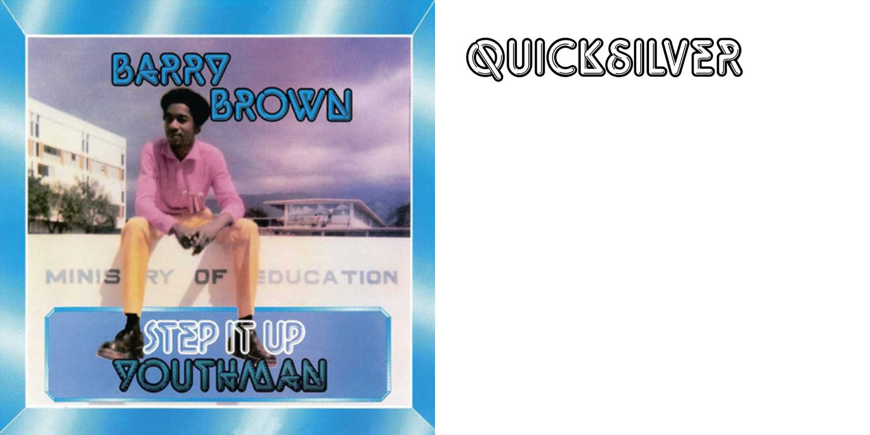
Barry Brown –
Why It's In The Canon
Found typography is a different education than type specimens. Barry Brown – documents lettering and type in actual use: shop fronts, signage, packaging, wayfinding, hand-painted surfaces — the accumulated visual language of streets and commerce. What the account trains is the eye's ability to read type in context rather than in a controlled layout, to see how weight, spacing, and material choice communicate before a single word is processed consciously.
For anyone working on brand identity or product UI, this matters because most type decisions are made against a white canvas in Figma and then deployed into a visually noisy world. Barry Brown – is corrective pressure against that. You start to notice what survives at distance, what reads as institutional versus handmade, what color-and-type combinations already carry cultural freight. The vernacular tradition here isn't nostalgia — it's active competitive intelligence. The retro revival in contemporary branding (food packaging, DTC, streetwear) is largely pulling from exactly this well, often without understanding which moves are load-bearing versus decorative. Spending time with this account teaches you to distinguish the two. It's an inexpensive way to build the visual vocabulary that usually only comes from years of moving through cities with deliberate attention.
Closest kin


