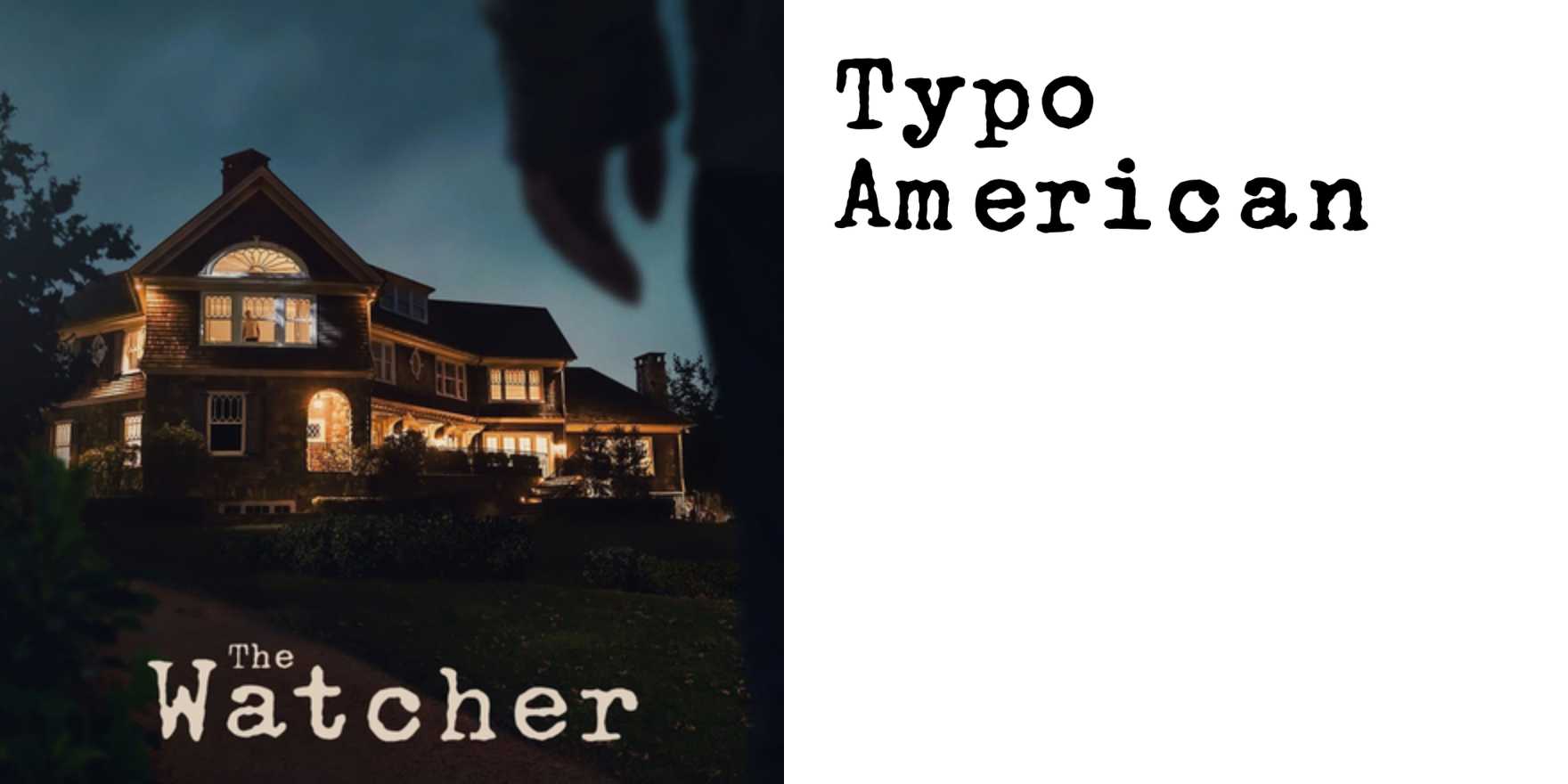
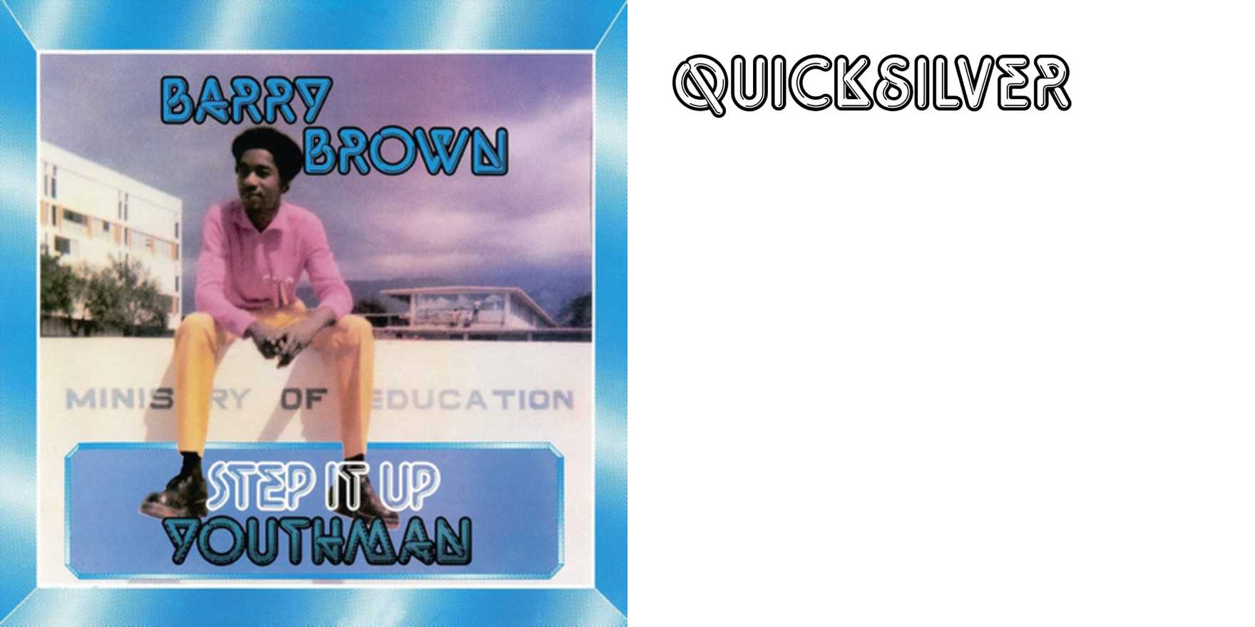
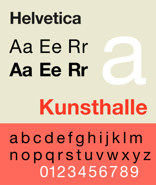
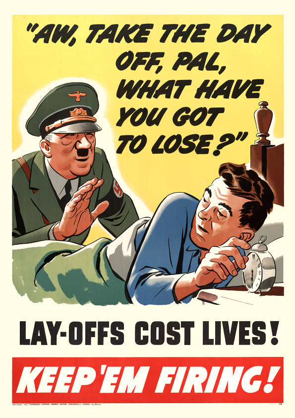
Howard Jones – “Like To Get To Know You Well” single cover
Why It's In The Canon
The cover works because the type is the image — no photograph, no illustration competing for register, just letterforms carrying all the visual weight. That's a harder problem than it looks. Spacing, weight, color, and scale have to do the emotional work that photography would normally offload, and when it fails it fails obviously. This cover doesn't fail. It belongs to a specific moment in British pop graphics — 1984, the same climate producing Neville Brody at The Face, Peter Saville's work for Factory Records, and a broader post-punk graphic discipline that treated the 12-inch sleeve as a legitimate design surface. The synth-pop sphere in particular leaned into type-forward design because the music itself was clean and constructed — the graphics matched the aesthetic logic.
Study the color and the spatial commitment. The decision to trust type entirely, to not hedge with imagery, requires a kind of conviction that's easy to admire in retrospect and hard to replicate under client pressure now. It's relevant for anyone building digital products or brand systems because the same move keeps recurring: wordmark-as-composition, type-led hero screens, interfaces where the text IS the visual. The failure modes are identical too — over-engineered and busy, or under-considered and flat. Seeing an example that lands tells you what the calibration actually feels like.
Closest kin