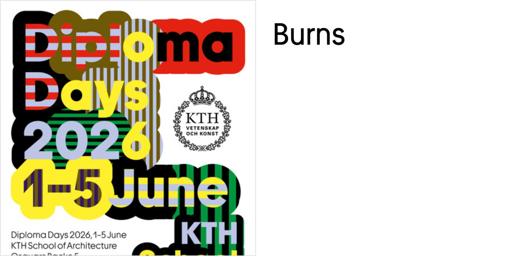
Diploma Days 2026,
Why It's In The Canon
Graduation season produces some of the most honest type-in-use work of any year — not because the stakes are low but because the brief is immovable. A name must be legible at distance, hierarchy must survive print and projection, and the whole system has to hold its authority across formats the designer didn't control. "Diploma Days 2026" earns study because it treats that constraint as a design problem rather than a ceremony obligation. Watch how the headline face handles formal weight without collapsing into regalia pastiche — the spacing decisions alone are worth reverse-engineering.
What this teaches, specifically: how letterspacing interacts with perceived authority; how to pick a text face that reads as institutional without reading as archaic; how print-first hierarchy translates (or doesn't) to screen. For anyone building creative tooling or branding systems, ceremonial type-in-use is underrated source material. It's one of the only contexts where legibility, cultural expectation, and print production constraints converge without a marketing brief softening the tension. The 2026 vintage is worth noting because it sits at a moment when serif revivals are finally being used with restraint again — less nostalgic mimicry, more structural confidence. That shift matters for web platforms trying to project credibility without defaulting to the same three system fonts.


