Semaine de la démocratie 2024
Why It's In The Canon
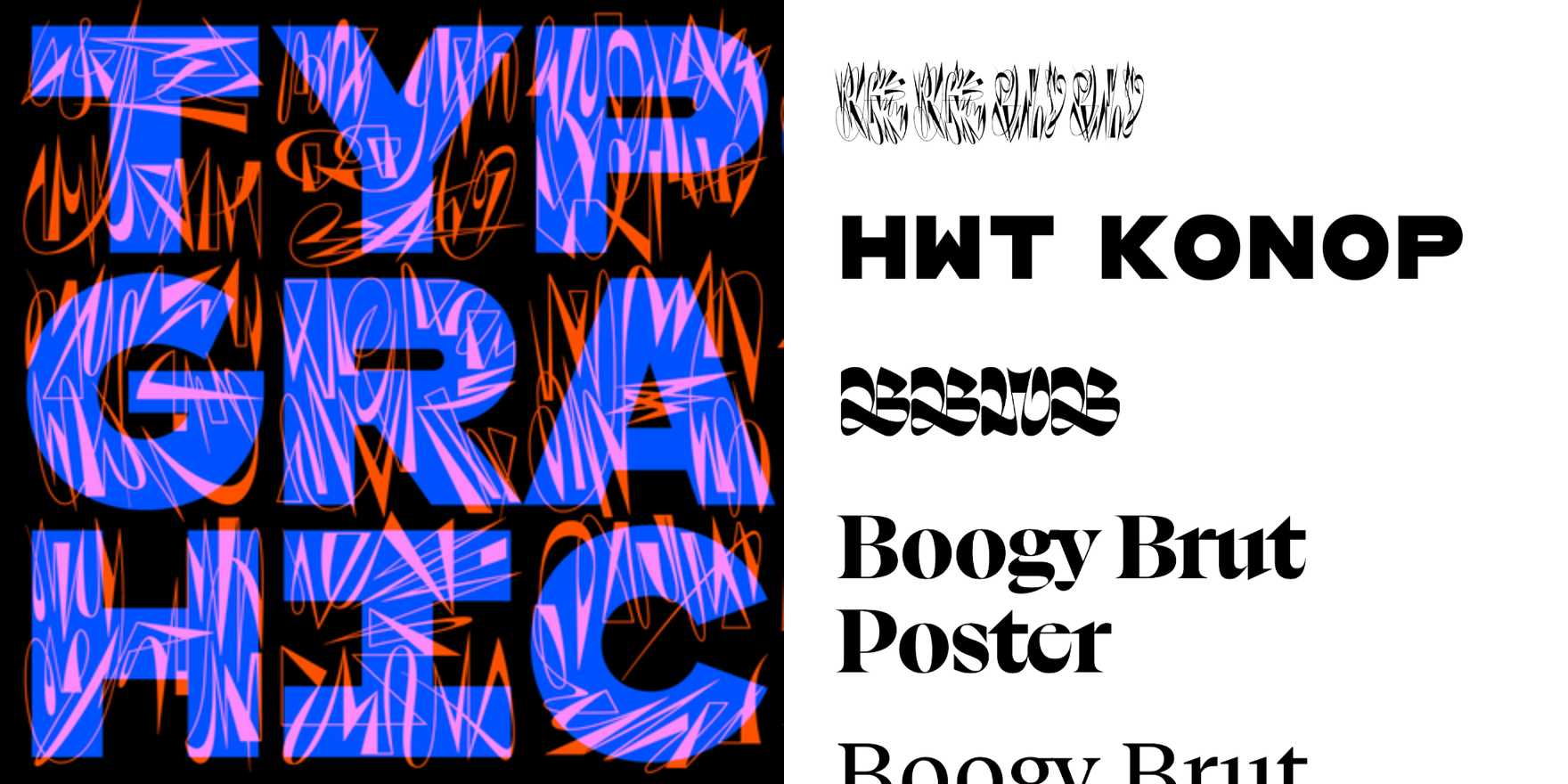
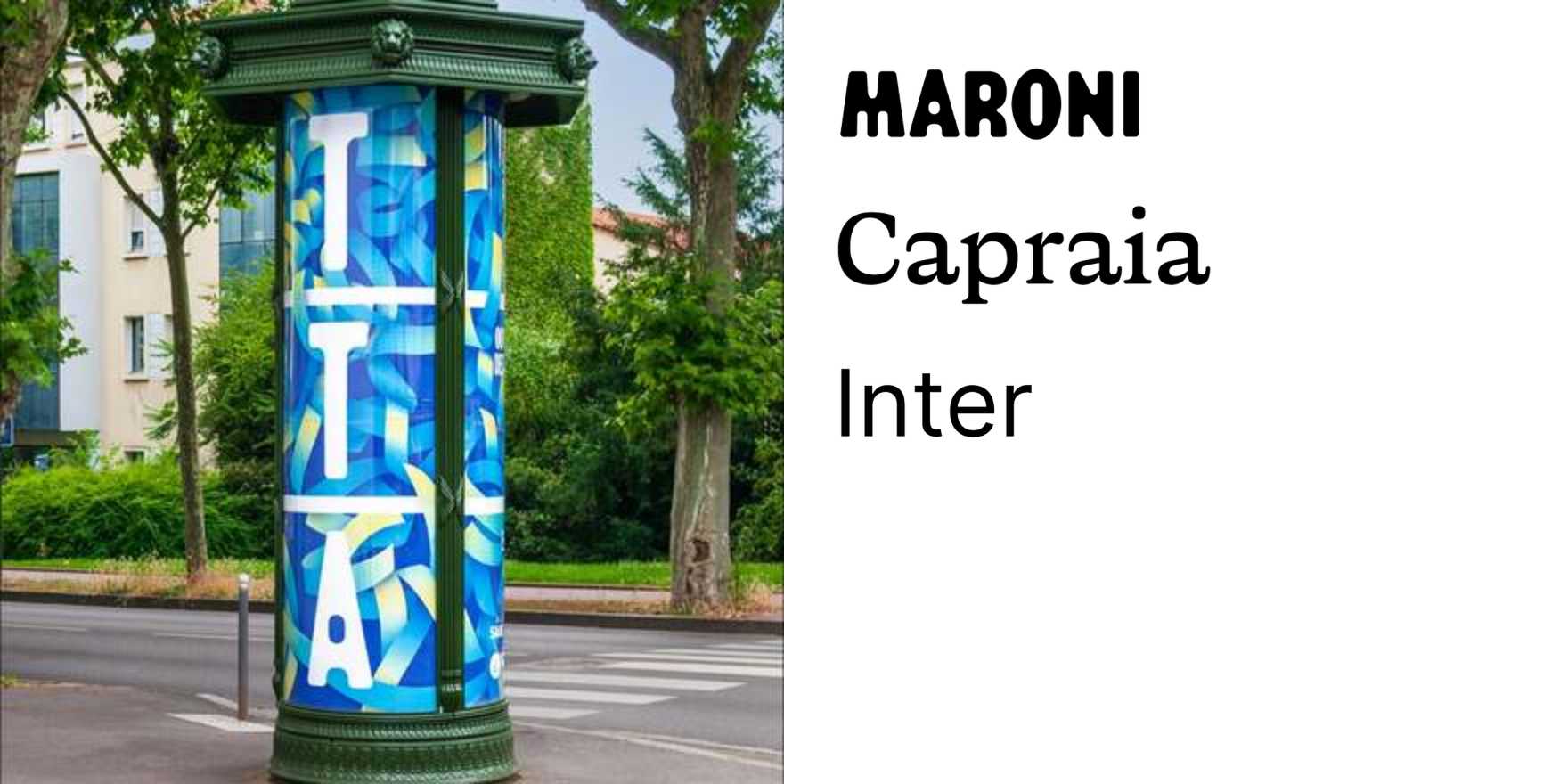
Civic identity design gets ignored because it doesn't sell anything, which is exactly why it's worth watching. The Semaine de la démocratie 2024 materials use type as a structural argument — letterforms scaled and weighted to carry institutional authority without tipping into bureaucratic inertness. That tension is the thing to study: how you signal democratic legitimacy through typographic choices that have to feel open and official simultaneously, neither too austere nor too approachable. French institutional design has a specific tradition here — a lineage running through the graphic vocabulary of the Fifth Republic, where type has always carried civic weight — and this campaign sits in productive friction with that legacy.
What makes it canon-worthy for someone working on platforms or branding is the constraint problem it solves visibly. When the subject is participatory democracy, the design can't be too authored — it has to read as belonging to everyone, which means typographic decisions that would look timid in commercial work become precise instruments. Study the hierarchy choices: how heading scale relates to body, where the system allows variation and where it locks down. The color discipline doing work alongside the type. This is how you build a visual language that's recognizably system-driven without looking like a template. That skill — designing with restraint as a democratic gesture rather than a creative failure — transfers directly to any interface work where the product has to recede behind its users.