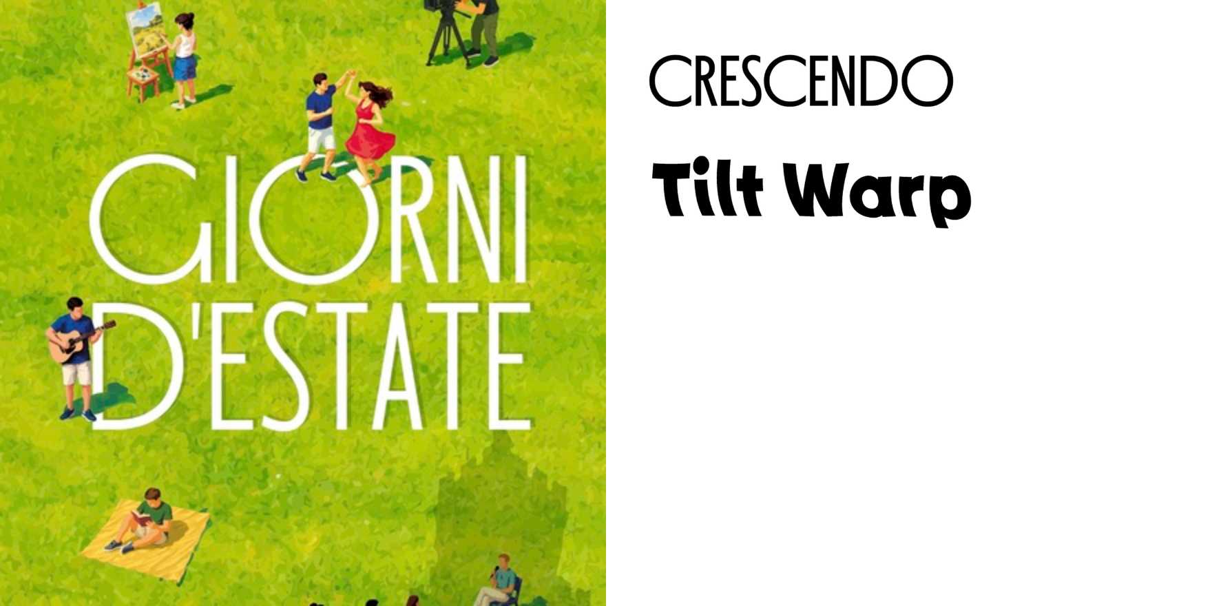
Estate Fiorentina 2026
Why It's In The Canon
Florentine summer programming as a design brief is inherently difficult: the city is so overdetermined aesthetically that most solutions either genuflect to the Renaissance or over-correct into generic modernism. What makes Estate Fiorentina 2026's type-in-use worth studying is how it navigates that trap — the typographic choices treat the city as a living context rather than a museum backdrop. The letterforms carry weight appropriate to stone and plaster without cosplaying history; the scale decisions work across both monumental street presence and small-format print in a way most identity systems only solve for one direction.
Study it specifically for hierarchy under pressure. Event programming requires type to do a lot simultaneously — date, venue, name, category, urgency — and the solution here keeps those layers legible without resorting to color as a crutch. That's directly applicable to platform UI, where information density is the default problem. The editorial rhythm, the way the type breathes between event listings, is also a real lesson: negative space as a structural decision, not a luxury. For anyone building design systems or templated content surfaces, this is a working proof that typographic restraint at the component level produces character at the system level, not blandness.


