Théâtre Théo Argence, Saison 2026
Why It's In The Canon
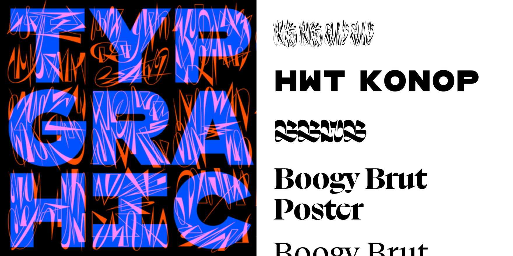
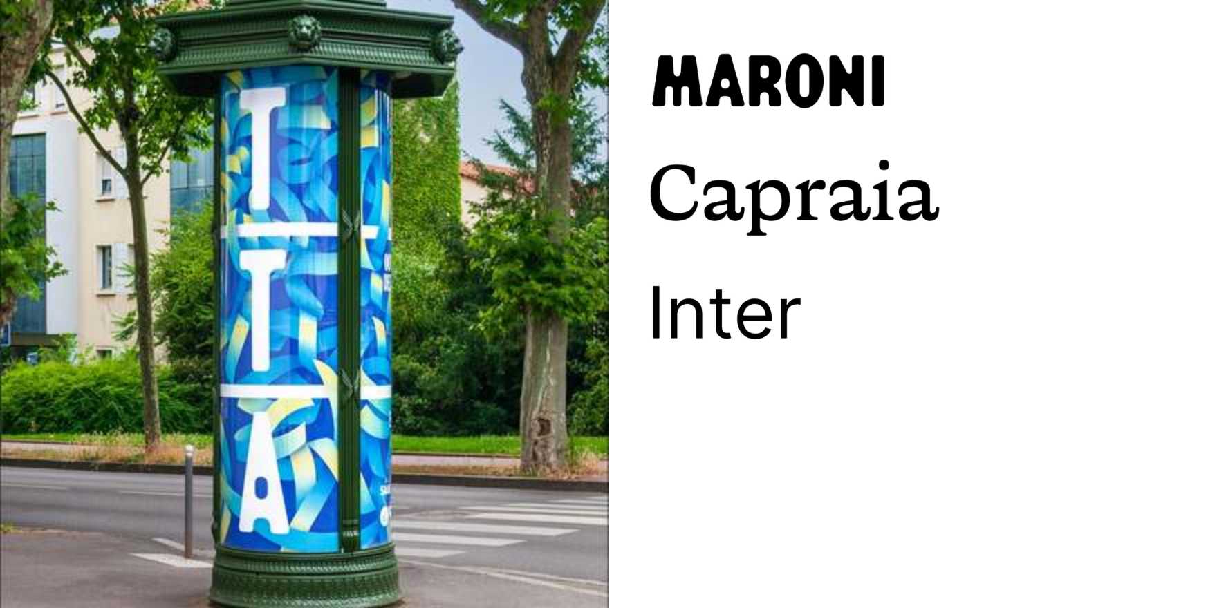
French cultural institutions have spent thirty years figuring out how to make type do everything a logo used to do — and the Saison 2026 materials for Théo Argence are one of the cleaner current examples. The identity uses typographic scale and weight as the primary spatial logic: no illustration layer, no icon system, just the collision of different type treatments asserting hierarchy through contrast rather than color. Study the kerning on the large display settings — it's tighter than comfortable, which is a deliberate choice to build tension rather than legibility. The grid underneath is loose enough to feel editorial, constrained enough to produce consistency across formats.
What makes it worth copying from: it solves the recurring problem in platform and branding work of making a rotating content system — a season of events, a product suite, a content calendar — feel coherent without locking it down. The trick is letting the type family carry the brand weight while the layout breathes differently each time. This is the direct lesson for anyone building content-heavy digital products or modular design systems. The French cultural poster tradition is one of the few contexts where this gets executed with rigor rather than gestured at — where "type as image" isn't a mood board concept but a structural decision with real production constraints behind it. That's the thing to extract: not the aesthetic, but the underlying decision logic about what the type is being asked to hold.