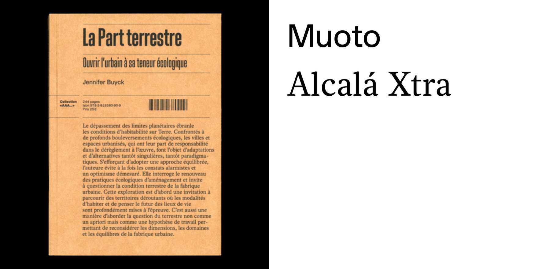
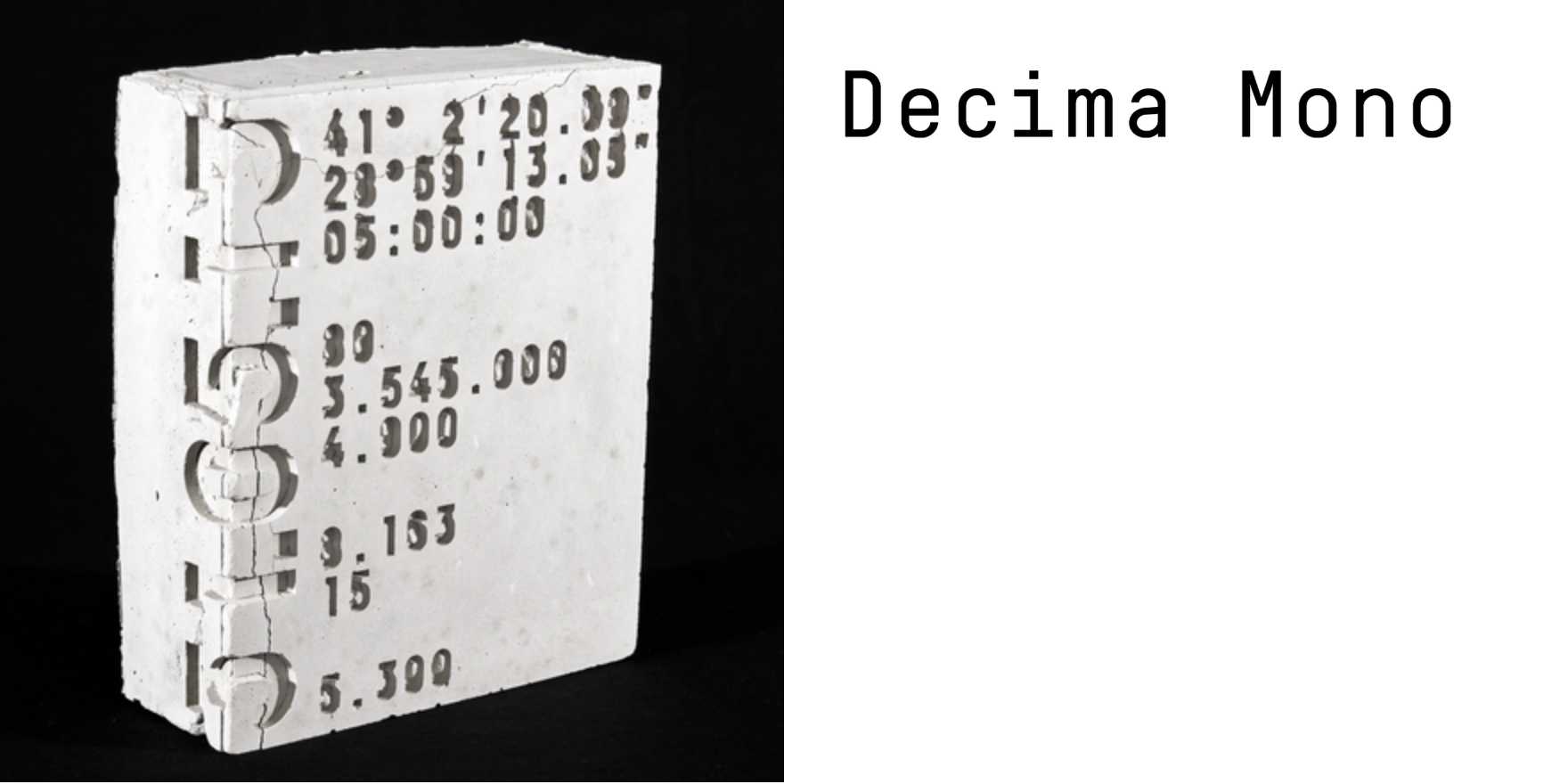
Eternal Mana event poster and merchandise
Why It's In The Canon
Event posters for underground electronic events are one of the few remaining spaces where type is allowed to be genuinely difficult — legibility traded for atmosphere, hierarchy bent to serve mood. The Eternal Mana work earns its place here because it understands that merchandise extends the typographic argument: a poster solves an information problem, but a shirt or tote proves the type system holds under compression, on fabric, at distance, without the visual context that made it legible in the first place. That test is brutal and most type-in-use systems fail it.
What to study: the relationship between the letterform choices and the event's ritual register — "mana" demands something archaic or charged, and whether the type rises to that contract tells you everything about the designer's confidence. Study how the information hierarchy collapses under scrutiny without losing its authority. Look at how tracking and weight function not as refinement but as signal — subcultural identification compressed into typographic decisions. For anyone building design systems or brand frameworks, this is where you learn that system coherence under constraint is the real test. Not the hero layout. The merch table.
Closest kin